Logo
tfar10 | Sun, 10/19/2014 - 12:38
Brief from client
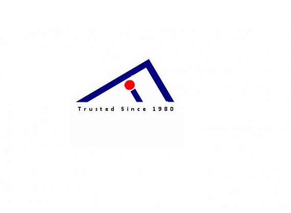
A Medical/Chemical/Scientific company needs a logo, the name of the company is Far Importing Company.

I made this simple one, tilting the F to make it get a peak, so the company is at the top or aiming to be there. I made the i in lower case with the dot in red stating that the customer is in the center of their interest and he is a red line and served.
in the slogan I added the word "trust" to make the customer feels secure.
ALL SUGGESTION ARE MOST WELCOMED


3 Comments
Why is there no word mark? If it's supposed to be in the symbol, well it's totally unreadable.
I must say, it doesn't look good at all. How did you do this? There are some weird dents all over. Very
Looks like it's been cut out somewhere with the magic wand tool or something.
Instead of a tagline, you need to type out the name of the company. I have no clue what this place is called without looking at your brief section.
The logo itself doesn't convey either letter in the company well at all. Try more ideas.