Brands of the World is the largest free library of downloadable vector logos, and a logo critique community. Search and download vector logos in AI, EPS, PDF, SVG, and CDR formats. If you have a logo that is not yet present in the library, we urge you to upload it. Thank you for your participation.
Version history
Version 1

- I
- S
- T
- C


4 Comments
Thanks for the comment!
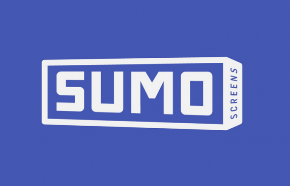
May I ask - what do you think about the screen facing this way, rather than right (as per the other version).
I concure with my esteemed colleague. I do like it too.
While there's nothing wrong with the main font, you want to fix the perspective that doesn't match the box.
The subtext is indeed too small and, worst of all, vertical. Pretty hard to read. I'd remove it altogether.
Good job.
Why not tilt the rectangle so the bottom is visible, and impose the subtext there? That way you avoid the sideways reading.
I like the perspective, it give an idea of grow up.
The "screen" type is to shy.