Logo CTS Corner ( Coffee Tea Spice)
andraarte Grafi... | Mon, 03/19/2012 - 21:31
Brief from client
1.The client wanted a logo with the components of the store.
2.The shop products were coffee, spices and tea
3.This was his new logo identity
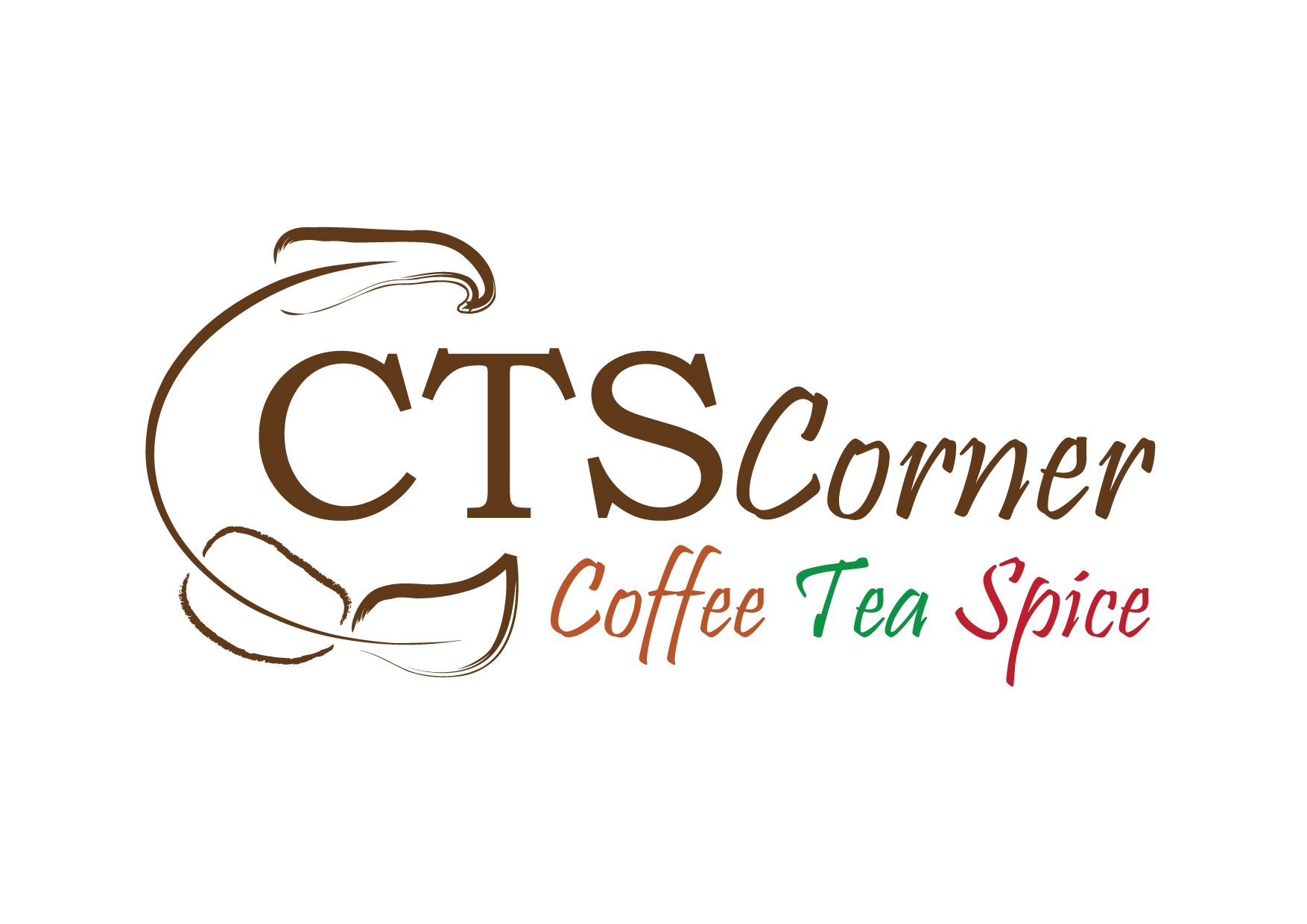
The logo has been created for a line of shops in Romania.
The font has been a requirement of the client.
11 Comments
I used a diferent type font on the bottom line.
I will...thanks.
I think this is a good start, i'd play with all of the fonts... It doesn't scream coffee tea spice to me. I would also tweak the colors to me a little less vibrant n more mello like drinking coffee or tea can be. The logo Icon is good but its kinda hard to distinquish the coffee bean from the tea leaf alot of people might over look that and just see leaves? maybe try to distinguish that a bit more? Great start so far i think this has potential to be a great logo!
SF
symbol is not too bad, i actually think it's nice, perhaps play around with it's location and have more fun with it. the type needs to be changed for sure as well as the colors. i just don't think they go along very well
Looks quite good, maybe some coloring in the coffee bean, tea leaf and chilly (or what the top thing is supposed to be) -symbols can make these stand out a little more. Text looks a little too much. Maybe also change the font for "corner" to same as "CTS" - the italic does not seem to fit well.
First, you are dealing with an unattractive name. CTS says nothing to me. So I would go with a stronger image to brand the chain. I would suggest looking around at coffee companies... if you haven't already! Try this link for ideas... not that I see anything that jumps out but look anyway. KEEP IT SIMPLE and scaleable! http://www.cruzine.com/2010/11/26/coffee-logo-designs/
Your image needs to say great coffee! or nice place to hangout! Find more unique fonts at http://www.1001freefonts.com. They have some really cool fonts for free so you don't eat into your budget! Forget all you know and look around... that great logo is right in front of you! Peace.
Thanks for links, really helps when you are uninspired...
I'm not a fan of this logo. I had no idea what the symbol was before i read everyone else's reviews even though i looked at it and tried to figure it out. The more i look at it the more i don't like the corner font. The edges are too sharp, exp. in the r and n. Try playing more with the bean and leaf idea not don't use a brush, only a line it could work well. I'd try the type in three separate lines with coffee, tea, spice in a smaller and simple font as a tag line would be. Also try to keep the colors down to two.
Thank you very much for your opinion...is really helping me...thank you again.
I like it...but your friends here are give you good advice...change the font...I will like it more...I know from Romania this logo..but not like that. Is very artistic...
Hum... sorry but i see nothing else in that symbol than a kind of unpleasing cock with two strange balls at the bottom.