Brands of the World is the largest free library of downloadable vector logos, and a logo critique community. Search and download vector logos in AI, EPS, PDF, SVG, and CDR formats. If you have a logo that is not yet present in the library, we urge you to upload it. Thank you for your participation.
Version history
Version 1

- I
- S
- T
- C


11 Comments
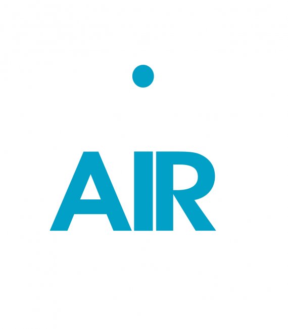
I think there is too much empty space. Which is ironic considering.
But if you made the A a curved style version with a straight side on the right, it would mimic the R. That would make the top of AIR really solid, and look a bit bouncy and round, so the dot would look more like it is jumping on a trampoline.
Waffles has given some good advice here.
I think you need to keep a reasonable amount space between the text and the dot, in order to keep it clear that it's a balloon floating. Maybe making the dot slightly more balloon shaped can help this too.
The 'A' is definitely the weakest part of the logo and doesn't balance due to the white wedge between the A and I. As well as trying a more rounded A, try it leaning up against the I too.
Is this a real company?
Plus, who doesn't love waffles? Especially chicken and waffles!!! :)
Indeed....mmmmmmmmmmm
I totally love waffles!
You probably figured that out though. ;)
completely agree with whats been said above, love the idea! you could maybe make the dot for the "i" the shape of a balloon instead so it relates to the business more
I agree that the A is the problem here. Slanting or curving it to the right to close up the gap would really help. Or you could try spreading the kerning some.
I really like the tittle over the "i" floating away like that. I don't think you should make it a balloon; that's a bit too literal for my tastes.
The I and the R are kerned a little too tightly.
This could be a idea, but just typing the font it and placing that dot upthere isn't merely enough.
You have to think in terms of structure and composition. I the whole logo was comprised within the limit of a isosceles triangle, it would work better.
Keep working on it, you're onto something.
Thanks guys, once again you've saved the day. I agree - not liking the space between the A and the I, I am going to revise this with your comments above. Alexi...they are not officially established yet so just playing with some logo ideas. Shawali - thanks for the triangle concept I think this will help alot! ...I want some waffles.
I agree with the rest, good idea, but needs some refinement. Also, try a version without capitals ("air" or instead of "AIR") and see if it works better or not.