logo fofr beauty parlour
tasrubabu | Fri, 10/17/2014 - 14:47
Brief from client
yetytfyftyh
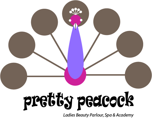
this is my last attempt. do u know i am confusing hearing many many idea. so my work is being more bad. now if any body do not like it i request him to say me what color i will do for head, for crest, for tail, for body etc. and i will be obliged to him if he suggest me the appropriate font.
11 Comments
Uhm.. Considering your brief section.
Patience young padawan. Patience and humility...
Oy vey...
Wrong attitude... Starting in graphic design can sometimes be frustrating, as you basically just come up with crappy designs. But it's normal, we all went through this awkward phase. Keep working and with time, you'll get better.
What you lack now, beside being able to keep a cool head, is a trained eye. This too will develop with time. You just need to look at a lot of logos, ads, packaging, etc...
It looks more like a retro clock if anything.
Point blank: this design, aside from color, isn't good. You're not gaining any ground by using the same design and just changing the colors.
I'm not sure what I can say other than what has already been said.
This logo is a learning experience.
It is as simple as that. Hopefully you have learned a lot and can grow from this.
There are two main problems with this logo.
1. It does not really look much like a peacock.
2. It is not pretty.
Those are the two words in the name! Those issues must be resolved.
You need to get away from this front facing peacock idea. It has been done famously. See, look! You need to put this idea in a file in your computer, and then never look at it again.
I had a peacock ornament for Mexico. It looked pretty much exactly like that...
Anyways, How to fix this logo? As I said before, burn it. Start again. But here are some steps of what you can do. You are just starting out after all, so help is always useful.
Okay. Well take a piece of paper. Write Peacock in one Bubble. Write Pretty in another. Then do a brainstorm. What does the word peacock make you think of? Colour? Tails? Write those in a bubble. What does tail make you think of? Feather! Branch out. Do this for at least 30 minutes. Fill that page.
Now look at your page. What words stand out? What words do not? What words are unexpected?
I tend to combine words. Perhaps something like 'Beautiful' and 'feather', or two unexpected words that 'feel' right.
Get a few of those combo ideas, or just really good words. Put them on the top of a page.
Now look at some peacocks! How could you possibly have missed this step?! You need to know what a peacock looks like to make a peacock.
Then sketch. Sketch. Sketch. Use your words and think up ideas that may be good. If you like how one comes out, refine it, draw it again, change something.
The pretty peacock does not need to have a logo of a pretty peacock. It can be a feather, just a head, heck it can be a race-car with flames for all that it matters, so don't dwell too much on it needing to be exactly what it is.
For this logo what it needs to be is pretty. This is a ladies beauty parlor and spa. You are trying to attract the kind of ladies that like to be pretty!
(That font is not pretty, that font is stylized and groovy!)
Finally, when you have used up all of your paper on logos. Take your three favourite symbols. A rough idea of font is fine, don't dwell on that yet. Bring those symbols here. Post them all. We will look at them. We will help. We promise! But no front facing, tail spread, peacocks allowed!
Finally, here I looked up 'pretty peacock' on google and found this. This is a good idea to look at and think 'Hey, that is a good idea, maybe I will use a certain part of that idea in how my lines flow. Look how pretty that peacock is'. Don't just draw this peacock, please.
Finally (bonus), only male peacocks are flashy. Lady peacocks (peahens) are brown. This entire business therefore makes me think that this is a spa for flashy metrosexual and gay men, not for ladies. You can not change that fact though.
"Lady peacocks (peahens) are brown. This entire business therefore makes me think that this is a spa for flashy metrosexual and gay men, not for ladies."
God i died while reading the end of this. Carry on Waffles great valid points you're making here :D
Please don't give up. This is all a process... a steep learning curve and the greatest injustice would be to quit... Don't quit.
I agree with Waffles that a peacock doesn't seem like a suitable brand/logo for a business targeting ladies because peacocks are only male (thus the “cock” in “peacock”). In fact, “Male animals are typically more elaborately ornamented than females.” (https://en.wikipedia.org/wiki/Biological_ornament#Female_Ornamentation)
Everyone here is trying to help you. Never get too attached to or too protective of a design/idea. I know it's hard to take a lot of criticism, but you must persevere and take their advice to heart. Waffles, in particular, has been exceptionally helpful—heed his words.
On your Shark logo I posted a few tips David Airey's excellent book “Logo Design Love” which I think are still very important for you to keep in mind:
10. Work in black and white
No amount of fancy gradients or color choices will rescue a poorly designed mark.
By refraining from using color until the end of the process, you and your client are free from distractions of a preference for, say, green, which leaves you free to focus on the idea.
12. Remember legibility
The public most likely will glance at the logos you design for only a second or two before moving on. So legibility is key, especially when the brand isn’t well-known. For instance, a client’s handwriting may look pretty, but if most people can’t read it immediately, then don’t consider using it as a logotype.
17. Aid recognition
Keeping your design simple makes it easier for people
to recognize it the next time they see it. Consider large corporations like Mitsubishi, Samsung, FedEx, and BBC. Their logos are simple in appearance, and they’re easier to recognize because of it. Keeping it simple also allows for flexibility in size. Ideally, your logo will work at a minimum of around one inch without loss of detail.
18. Test at a variety of sizes
Try printing your work to ensure it’s clean, with a good level of contrast on paper, and not pixelated. But don’t just print a single logo. Replicate the design at a range of sizes and colors for variation. There’s no point in using a full page of paper for just one tiny design.
23. Don’t be afraid of mistakes
Everyone makes mistakes. Learn from them, and move on.