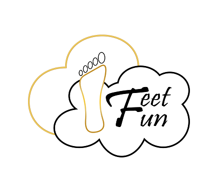
Logo for a footwear company
Brief from client
hi,
i need new logo idea for our slippers brand:
emphasis on this points please
1. comfort
2. luxury
i attached our old logo, we need it in english also in Hebrew.
after getting first sketch that you will be ask to make it in Hebrew letter that we will provide you.
thanks,

Hello Everyone,
Hope you are all doing well.
Let me begin by saying that I'm an infant logo designer...you can even say just born baby. The current pandemic gave me an opportunity to learn a new skill and I started out by reading about Graphic Design and scouring the internet for stuff that would help me learn. Then I watched some top rated YouTube channels and slowly started out sketching based on project briefs that I found on the internet and illustrating them on Adobe Illustrator. I'm still finding my footing, but I read on all the forums that it is better to get opinions from experts to learn more. So, I am putting myself in your hands. Kindly give your honest feedback about the logo. I'm here to learn.
Now the idea behind the logo. According to the brief the client wanted to depict comfort and luxury, so I used a cloud and heart outline to place a feet inside them to show comfort and then used the gold and black colors for depicting luxury.
I think I've babbled enough...Kindly give your feedback.
Regards,
Kavita


3 Comments
Another variation for the same logo brief...I used typeface to create a heeled shoe
The idea isn’t bad but it still needs a lot more work. There’s something a little weird to the shape of the foot and toes, maybe the foot should have more curves on the top, like a real one would and the toes shouldn’t be made with the shape tool. The heart isn’t really noticeable unless you read that it is one. The stroke overall is too thin, especially the golden one which seems to be filled in and have and orangey outer stroke. Lose the gradient on the feet. The font doesn’t really work. On the second version I can’t see a heeled shoe at all and the font is just a default one that comes on every computer, you should download one that can work with the logo.
Thank you for your feedback. I'm trying to learn as I go and your inputs have helped me a lot :)!! I'll surely work on the suggestions that you've made.