Brands of the World is the largest free library of downloadable vector logos, and a logo critique community. Search and download vector logos in AI, EPS, PDF, SVG, and CDR formats. If you have a logo that is not yet present in the library, we urge you to upload it. Thank you for your participation.
Version history
Version 1

- I
- S
- T
- C


7 Comments
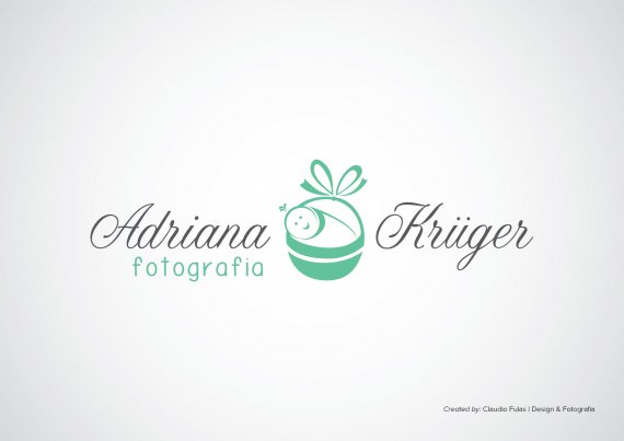
I like it. Not so sure about the "fotografia" part. I think i would just remove that as a whole and just stick with the name and symbol. You could quite possibly make the dots on the ü green if you persist on using a green accent.
Good job!
nice! (Photography) looks off place, have you tried stacking them all vertically?
This logo has potential bbut it needs some refinement. The biggest of which is the symbol. It looks not thought through enough, done to quickly, straght on the computer.
You also have a problem of composition (a thumb for this would be great =) The fact that "fotographia" is on the left side while the logo is meant to be centered with the symbol in the middle throws the whole thing off balance.
keep it up!
What are you? His mother? :D How do you know he's done it straight on the computer?
Call it an educated guess =)
I agree with the symbol. The baby/basket combination is okay, but it looks a bit uncomfortably portrayed, if that makes any sense. Just refine it a bit more, I think. The rest of the work is pretty much taken care of. I also agree with the placement of "fotographia."
This has too much thick and thin going on—in an unbalanced kind of way. I've highlighted the elements that won’t scale well: http://cl.ly/image/2k2f3d3z340O
The type doesn’t fit well, there is way too much going on in that department too.
A few tips from David Airey's excellent book “Logo Design Love” which I think are important for you to keep in mind:
10. Work in black and white
No amount of fancy gradients or color choices will rescue a poorly designed mark.
By refraining from using color until the end of the process, you and your client are free from distractions of a preference for, say, green, which leaves you free to focus on the idea.
12. Remember legibility
The public most likely will glance at the logos you design for only a second or two before moving on. So legibility is key, especially when the brand isn’t well-known. For instance, a client’s handwriting may look pretty, but if most people can’t read it immediately, then don’t consider using it as a logotype.
17. Aid recognition
Keeping your design simple makes it easier for people
to recognize it the next time they see it. Consider large corporations like Mitsubishi, Samsung, FedEx, and BBC. Their logos are simple in appearance, and they’re easier to recognize because of it. Keeping it simple also allows for flexibility in size. Ideally, your logo will work at a minimum of around one inch without loss of detail.
18. Test at a variety of sizes
Try printing your work to ensure it’s clean, with a good level of contrast on paper, and not pixelated. But don’t just print a single logo. Replicate the design at a range of sizes and colors for variation. There’s no point in using a full page of paper for just one tiny design.
23. Don’t be afraid of mistakes
Everyone makes mistakes. Learn from them, and move on.