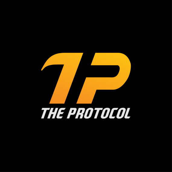
Logo for eSports Team
Sagar7555 | Wed, 11/05/2014 - 10:43
Brief from client
We would like to communicate: 1) A Sense of Mystery, 2) Power, 3) Determination
Adding a sense of fun and creativity would also be welcomed.
We'd like to stay away form evil or darkness type imagery.
We'd like a logo that is integrated with the name - but a logo that can also stand alone.
The name separated from the logo would be ok in the right circumstances, but generally an integrated concept would be preferred.
Also, using a minimal color palette would be preferred - 2 color best, 1 and 3 are ok, more is discouraged.


2 Comments
Great start so far. I will say, however that the T to me reads as the number 1. I think with a small arm on the other side might resolve this. Or make the top less curved.
Not much to say otherwise, possibly align the orange legs of the letters with something in the type? Maybe that's just my OCD talking.
I'd say resolve the first letter and you're set!
Thanks for feedback. I am working on it.