Brands of the World is the largest free library of downloadable vector logos, and a logo critique community. Search and download vector logos in AI, EPS, PDF, SVG, and CDR formats. If you have a logo that is not yet present in the library, we urge you to upload it. Thank you for your participation.
logo for jamaican magazine cover
Ellimac | Wed, 08/28/2013 - 20:33
Brief from client
logo should give an island feel "jamaica" strong but simple
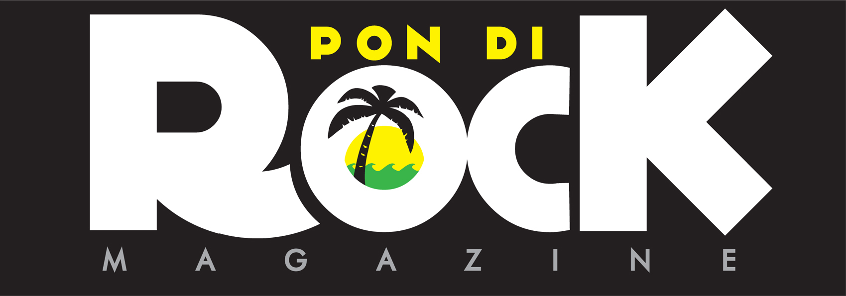
This piece is crisp to da maximum.. er, I mean; this is a splendid piece of work.. However, I would have placed the palm tree not on a wave, but on an island made from rock...
I'm not really sure f the symbol. I know you want to give the logo a Jamaican feel, but to me it looks just too plain. More like a travel agency. Can't you have a symbol that really represent Jamaïca? Beaches and palmtrees can be found all over the world. It's too generic.
I love the main font. It comes off really good and is perfect for a magazine. Two quick tweak though : the "pon di" part should be a bit higher, its top aligned with the top of the R and K. Also, the "magazine" part should be either properly centered or justified on both side.
Last thing: I'd make sure the space between the R and the O is the same than between the C and the K. For kerning's (and my OCD's) sake =)
Globally, this is looking pretty good, minus the symbol.
I with I knew more about the assignment, or the context for which it will be used in addition to "magazine cover"
Will it be used on letterhead, etc. will it always be on a black background?
Assuming that its practical and the white type-on-black is not an issue, I think it's a fun, festive logo. I like having a graphic inside the O, to add a bit of personality.
All this said, I like it, but don't love it. I wish I had something else to compare it
to...something totally different...and again, I wish I knew more about the magazine, etc.
7 Comments
love the idea which signifies Jamaica (The Rock)
I like this! i think its fun and looks appealing to my eye
THNX MUCH :)
This piece is crisp to da maximum.. er, I mean; this is a splendid piece of work.. However, I would have placed the palm tree not on a wave, but on an island made from rock...
I'm not really sure f the symbol. I know you want to give the logo a Jamaican feel, but to me it looks just too plain. More like a travel agency. Can't you have a symbol that really represent Jamaïca? Beaches and palmtrees can be found all over the world. It's too generic.
I love the main font. It comes off really good and is perfect for a magazine. Two quick tweak though : the "pon di" part should be a bit higher, its top aligned with the top of the R and K. Also, the "magazine" part should be either properly centered or justified on both side.
Last thing: I'd make sure the space between the R and the O is the same than between the C and the K. For kerning's (and my OCD's) sake =)
Globally, this is looking pretty good, minus the symbol.
Good luck!
I agree with Sawali. No more. But I consider that you have talent! ;)
I with I knew more about the assignment, or the context for which it will be used in addition to "magazine cover"
Will it be used on letterhead, etc. will it always be on a black background?
Assuming that its practical and the white type-on-black is not an issue, I think it's a fun, festive logo. I like having a graphic inside the O, to add a bit of personality.
All this said, I like it, but don't love it. I wish I had something else to compare it
to...something totally different...and again, I wish I knew more about the magazine, etc.
Overall, good effort!