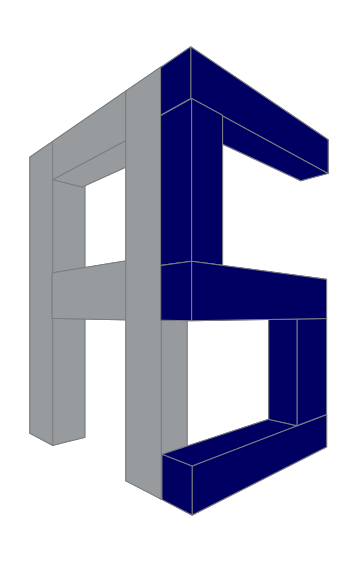
logo for local construction engineer
june s | Wed, 06/17/2015 - 11:11
Brief from client
- local construction engineer
- small company
- mainly industrial buildings
- small private buildings
- initials: A S
- colour: dark blue
- local construction engineer
- small company
- mainly industrial buildings
- small private buildings
- initials: A S
- colour: dark blue
7 Comments
Meh, there's nothing really happening here. It severely lacks inspiration, sketching and work. Overall, it feels very lazy.
From your brief
- local construction engineer
- small company
- mainly industrial buildings
- small private buildings
- initials: A S
- colour: dark blue
This only tells us two of your six important points.
- As just a symbol it is a start of something, but the perspective is wonky. Why would you draw these letters when you can just click a button in illustrator that does it perfectly?
- Your two blues are too close together, it looks like a mistake, not a design choice.
I don't think I would classify this as a logo yet.
I mostly agree with Shawali and Waffles. Waffles, June S actually got three things out of six from a menu. I think that this logo can be salvageable if a designer can go into a direction AKA El Lissitzky / Rodchenko/ Mayakovski style with adding some industrial symbols plus a sharper more dynamic perspective. This one looks too plain , lacking that construction/ building effect.
Interesting assessment Camobap. I am curious as to which of the six I missed, can you please let me know?
Hello Waffles, you missed a blue color. By the way, I left you a message on your message on one of my logos - did you checked?
These were the two of the six I was referring to, I should have been more specific. :)
- initials: A S
- colour: dark blue
Sidebar: I looked all the way back to page 12 of posts but didn't see it. Sorry. Feel free to let me know though, but lets not clog up this topic! :D
too simple and plain.. and this logo design is to common... i see like this designs from the internet... that's all :)