Brands of the World is the largest free library of downloadable vector logos, and a logo critique community. Search and download vector logos in AI, EPS, PDF, SVG, and CDR formats. If you have a logo that is not yet present in the library, we urge you to upload it. Thank you for your participation.
Version history
Version 1

- I
- S
- T
- C


6 Comments
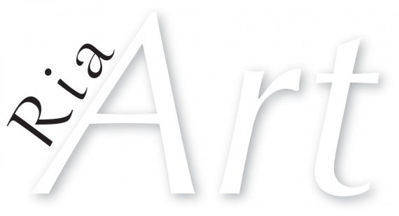
To my eye, these two typefaces are too similar to compliment each other well. If you are using Optima for the sans, try a serif with less contrast.
drop the shadow. Try new fonts, relocate "Ria" and make everything black.
That will make it far more quite and professional!
Good luck ;)!
Very hard to read at the moment, may look better with stronger contrasting background. Best bet to change colour (all black??) and try to find a similar font, but one that works better and pop it on here and we'll see.
Also, the 'ria' doesnt look right with the font, ,the 2 fonts dont work together, sorry
Yeh I don't know if you created that brief after making the logo or it's just a very specific hard to work with brief...
Definitely drop the 'drop shadow' and could you use a Dark Grey or light grey at least just so it's not black and white.. Think this needs some more work especially the font selection.. Goodluck
Yikes. Unfortunately, this isn't looking good at all and certainly not professional. The gimmicky shadow effect does that, so do the bad kerning, bad choice font, bad composition and the general impression that this logo has been done in 5 minutes top, without any sketching beforehand and finally the general lack of inspiration.
Check out these sites to see great logos and get that much needed je-ne-sais-quoi that gives wings to your creativity: www.logopond.com www.dribbble.com
No transmite nada, solo lectura.