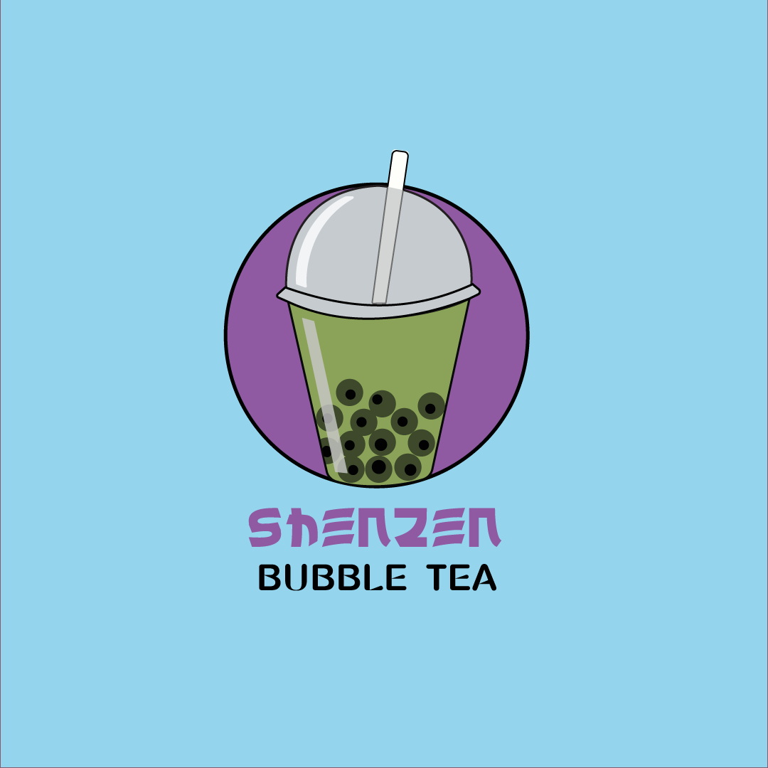
Logo for Shanzen Bubble Tea
Brief from client
I am the owner of Shenzhen Bubble Tea! We operate over a hundred little kiosks over the city that sell assorted Bubble Tea beverages. We started only a few months ago and we’re growing quickly as our brand is becoming very popular!
Our current logo is a bubbly typeface that we love, but it’s incredibly hard to read from the distance and isn’t immediately obvious that we sell bubble tea on first glance. I want a symbol-based logo of a bubble tea icon that we can use on our cart’s signage and menu.
Ideally, the design can also be modified to represent different kinds of bubble tea types that have different milks, sugar levels, temperatures, and ice amounts. I was thinking we have a primary variation of the logo and small spinoffs to describe the different bubble teas on our menu.
I also want to keep the logo design super-friendly so existing customers can recognize us after the rebranding. After all, our staff are well-known for their cheerful and helpful attitudes! It’s part of the reason why our brand of Bubble Tea is a family-favorite across Shenzhen, China!
I’m hoping you can design a friendly logo to improve our business.
Looking forward to your reply,
Allis Yeng
1 Comments
Hello! Firstly, I love the idea of your business :) and while I think your logo is definitely headed in the right direction, there are a couple things I think can improve it to make it more recognizable, legible, and family-friendly like you want.
Firstly, the font itself. I like the one used for Shenzhen. It's unique and fits within your reason for starting the business. However, the font chosen for 'Bubble Tea's is also pretty decorative and is competing a bit with Shenzhen. I would replace the 'Bubble Tea' font with something more simplistic, like a sans-serif font. Simple, to the point, and doesn't distract from the unique, decorative font in Shenzhen.
Now onto the logo. For me, it overshadows the text, and is a bit more complicated than necessary. The colors are nice, but there's far too many shades of green and grays for my liking. The best logos are simple enough they can be printed across apparel, signs, business cards, and labels. I would try and bring it down to the basics. Also right now, only the straw is breaking the barrier of the circle enclosure. Having more of the cup break that barrier could make this logo more dynamic and eye-catching (just an idea!)
Have fun and good luck :)