Brands of the World is the largest free library of downloadable vector logos, and a logo critique community. Search and download vector logos in AI, EPS, PDF, SVG, and CDR formats. If you have a logo that is not yet present in the library, we urge you to upload it. Thank you for your participation.
Version history
Version 1

- I
- S
- T
- C


2 Comments
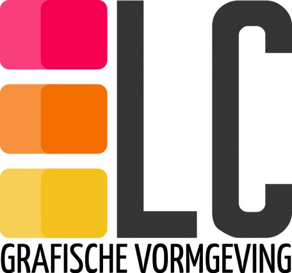
No idea (or I don't get it). Typography is squashed. Everything is too close together. Learn about white space. And if you're a designer you need a much much better logo! Good luck redesigning.
Hello and how are you!? I think that you have all your ingredients here - they are laying properly to form your logo, in other words you haven't spend enough time to think about a clever resolution of a composition, as of yet.Take a look of a negative space that " C " offers to you... Can you picture the three cubes on a left of " L " going in there to form a " C ", then you would white out a visible part of the current " C " place " L " around that and you should have yourself a personal mark with your favorite colors with grafische vormgeving beneath. I can see, also, of letting go black/grey and replace with purple/lavender instead. Good luck.