Brands of the World is the largest free library of downloadable vector logos, and a logo critique community. Search and download vector logos in AI, EPS, PDF, SVG, and CDR formats. If you have a logo that is not yet present in the library, we urge you to upload it. Thank you for your participation.
Version history
Version 1

- I
- S
- T
- C


6 Comments
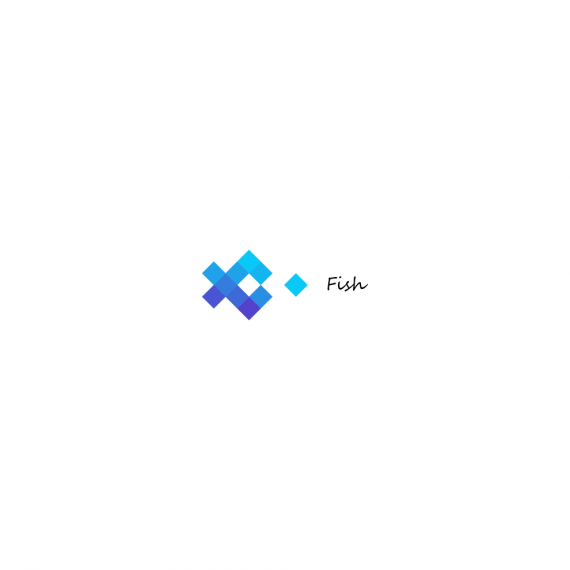
I like the idea of a eating fish and the symbol is nice. But what's up with the Typography? 'Fish' is just standing there on its own, it doesn't work together. You should enlarge it and choose a better position I think. Maybe an other font?
Really cool picto of a fish, but that font work is really lazy.
thank you. You Are Right. The font is not well suited to the logo. I wanted to make a contrast. Logo - geometric, and the font - a "living, handwritten."
P.S. Googl translator. )
Put the copy under the fish, and choose something else for the font. Maybe all lowercase for it as well.
The font itself isn't the only problem. The placement and the proportion vis-à-vis the symbol are also at fault.
Love fish! Maybe pick a watery looking font and have the "F" large on the left side and the "H" large on the right in blue, like water and change the fish to orange. It will look like it is swimming.