Looking for advice
Brief from client
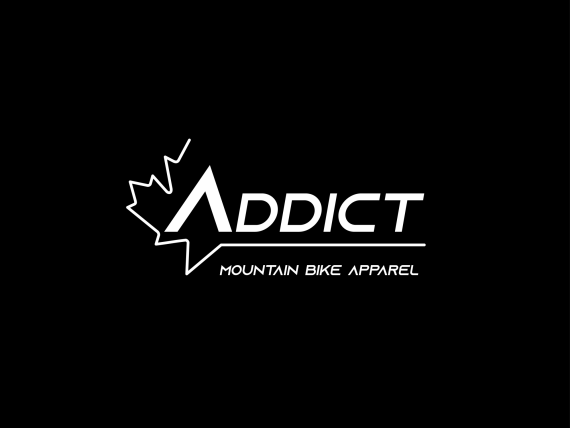
Hello, trying to make my own logo here. I do not have much experience with illustrator but this is what I came up with.
It is for a sportswear company ( cycling jerseys )
I need it to be simple because I value simplicity and good times. Also the jerseys will be made in Canada

Alright so I came up with a bunch of difrent logos and this is the one I like the most so far.
I put in on mockup hats and shirt to see the result and it looks good ( to me )But I feel like i'm missing something to make it better.
On the left you can see half a maple leaf to represent the canadian part of the brand.
Not sure if I was right to link it to the line under the word Addict.
and speaking of the word Addict I don't know if the positioning is right.
I'm looking for advice from experienced people on how to make it better.
Thank you very much and I will definatly post updates


1 Comments
The Tagline should use regular A letters. The leaf line seems a bit light-weight.
It is a cool design. Nice Work!
Naming a company Addict is daring... It carries a negative vibe...
Something like Ardent maybe... Ah, what's in a name ; ]