Brief from client
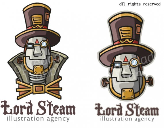
Creative logo for an illustration agency. The logo must be an illustration itself.

The name of the illustration agency is Lord Steam, and is inspired in the steampunk genre. So i draw an Steampunk Robot Lord as logo. Is currently an idea, not definitive. What do you think?

5 Comments
For what it's worth, I believe that the brief was met - It definitely looks illustrative.
However as a logo, or shall I say, if you would like to have this become a logo, I can't help but not ignore some basic principles of effective logo design. Even considering your client's requirements, you will just have something more effective to communicate your ideas (and theirs) by keeping things simpler - way more simpler.
Firstly, you don't need the watermarks and the "All rights reserved" in your submissions. The work is your property and this website abides by that, so you needn't worry about it being copied. In their terms of use it states this clearly so no worries - that way we can focus more on your logo without any distractions. :3
I love the illustration, but some things to think about is simplifying the colors to just 2 (Maybe 3 but that's pushing it). This will give you something to think about in terms of what you feel should represent your design color-wise and also give your logo a clean look from the get-go. And if I had to pick, I'd start with your right logo for the symbol. Think flat in your next iteration and then see if you get any critiques on working up, if you are getting better responses with the flatter look, which I'm pretty sure you may, then you know your color choices were successful :3
Your typography is steam-punkish, but I'm pretty sure you can find an even better one, check out losttype.com, fontsquirrel.com, and similar sites (do NOT use da-font.com) for your fonts, use logopond.com and dribbble.com for inspiration on type usage and effective logo design. A bold serif or slab serif may work to get a more Victorian-Era look, which is what your logo's style is based on.
Hope this helps! Really excited to see how this will turn out. Keep at it!
Wow, thanks Gigafrost, it is really helpful. I buy your idea, I'll try something simpler, flat designing.
I also agree about the typography, I'll search anyone better. I didn't know about some of those websites, I'll visite them now.
And now I know the terms of use in this website, I won't use they copyright again.
Thanks!!
I love the illustration! and i no Gigafrost has said that it needs to be simplified a lot to look like a logo but i disagree! i think in this case because the company is an illustration company then it should 100% have an illustration as part of its logo to show that off.
I definately agree with him about the font choice though. you need to go for something thats more in keeping with the illustration and if you do a good enough job on the font you could use the font alone as the logo and the illustration as part of the branding.
Very nice work :)
I agree with m@ on this. You're an illustration company, you can have an over the top complex logo.
Just keep in mind that it needs to be usable in black and white in a small size, too. Maybe make a seperate, simplified version for that kind of use.
I don't like the typography. The "lord steam" font is too medieval instead of 19th century, the "illustration agency" font doesn't fit with the rest. Maybe check fontsquirrel and losttype for a better combination of fonts.
It's a nice illustration!
But they've already told you, you'll need something simplier to call it a logo