Love Factory
minsulanda | Mon, 01/14/2013 - 17:50
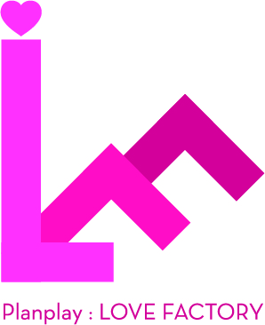
Brief from client
This is a group that does non-profit performance to many various people.
thanks for your opinion!
This is the 2nd draft on Lovefactory.
the color came out weird while converting it into CYMK from RGB.
color is not definite from the client anyway.
We gotta look it over later once the concept goes through.
:)
5 Comments
I'm sorry to be the bearer of bad news... but I don't think this works. For starters, I see your comment about converting from RGB to CMYK - is there a particular reason that you're working in RGB to begin with? Unless this is something that's only going to be seen on a computer screen or phone/tablet screen, (ie- if it's never going to be printed) then you might be better off just working in CMYK right from the get-go!?
But in terms of design.... I just... I don't think this works. The color is too vivid- it kind of hurts the eyes, and the letters being arranged like that just leave me 'meh' - I think you should do something more. Were it me, I'd scratch this idea altogether and sit down with a notepad and think more about what the company actually does and how to translate that into a symbol that says more than just having the first letters of the company arranged together. (Also, and maybe this is just me and my sick mind- but I honestly see some sexual position when I look at the letters. When I clicked and saw "love factory" I toooootally thought "Oh, I was right! It's like a sex shop!") Heh...
Anyway, I guess the bottom line is that this doesn't feel creative at all. It looks like the first letters were just tossed on top of each other and then two of them were rotated 45 degrees.
I don't know why, but it reminds me of a logo made for some big event. " (Also, and maybe this is just me and my sick mind- but I honestly see some sexual position when I look at the letters. When I clicked and saw "love factory" I toooootally thought "Oh, I was right! It's like a sex shop!")" - Totally agree here with Sara.
To say a few words about it myself- the symbol breaks away, literally, color is burning eyes, typo is boring in the given context and it does nothing to save the situation (so that makes it the last of the problems), the overall idea has no substance and personality (or i lack to see it). Pencil and paper are good for ideas and very often a good place to start your work- take Sara advice (and mine) and remake the idea....
also maybe you could explain more about the kind of pernformance and the audience of the organization, instead of being so literal about Love = heart and Factory= that i guess you wanted to build a factory with the letters.
When I clicked and saw "love factory" I toooootally thought "Oh, I was right! It's like a sex shop!")" - Totally agree
Entertainment lovers can enjoy endless hours of exciting content through our unlimited collection of videos designed for smooth streaming. With high-quality visuals and organized categories, every viewer can find something that matches their mood perfectly. The platform is built for seamless performance on all devices, allowing uninterrupted viewing anytime. Users appreciate how easy it is to navigate and access favorite clips without delay. In fact, the experience becomes even more engaging when they come across คลิปxxx here https://xn--l3ca3evbr.com/ enhancing the enjoyment with popular trending content. Reliability, speed, and variety make this collection a top choice for entertainment seekers.