lucent vodka
Brief from client
Mock brand identity for my own practice. This will be for a vodka company called lucent. Lucent means glowing, clear, or bright. My inspiration is neon glow, light streaks, backlit photos of clear vodka bottles, classy, luxurious nightclub. Obviously all of that will form more with other aspects in the identity, but I'm wondering if you guys get that "mature youthful luxury" feeling from this wordmark. I wanted the C to be a focal point that could suggest many things- a halo, source of light, eclipse, sliced fruit on the side of a glass (for that I thought about turning it downward some so the opening would match the angle of it resting on a glass, but then the roundness and small opening makes it initially read more as an O.) In any case I don't think this needs to be overthought. There aren't supposed to be any true recognizable shapes or items in this wordmark, but more of just the overall general feeling of youth, luxury, fun, colorful, glow. Thoughts?
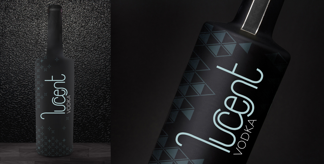
Pretty much the same logo as last time. I cleaned up some of the curves in the letters and added a subtext of vodka. I'm thinking of creating 4 patterns to go with this branding and here are the first two I've tried. I'm wanting to use a lot of matte black throughout the brand too including the bottles. Thoughts?
11 Comments
Looks sharp. Saul Bass would be proud (in his Pink Panther phase)
I think it works pretty well. The mockup itself isn't top notch (always prefer a photo based mockup than a 3d model)
Good job!
Yea the one on the right is a photo, but for the left one I had a hard time finding a matte black full bottle with decent resolution :( I'll do some more searches.
Fair enough. Nice job on the patterns, by the way.
Thanks!
I can dig it. I'll have a double, straight up.
Nail polish, that's what I see
The logo looks a little superimposed but we already have an idea of how it would look in a bottle and really looks great.
Good job.
A successful mock up I would say.
I wonder if you were let go of " l " and " t " - how would that " ucen " be without it?
The wrong brand name.