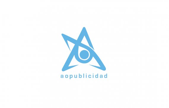
Marca Andres Orozco
Brief from client
Independent publicist, brand based on the initials of Andres Orozco
Publicista independiente, marca basado en las iniciales del nombre Andres Orozco

"A"+ "O"
Eye: visual, observant, detailcritical.
Star: success shiny
color blue: cool, calm, friendly
the initial idea is the work of the A and O, forming a star in their midst is the shape of an eye without having to alter the graph to create the eye.
It is my casing as an independent publicist. (freelance)
-----------------------------
"A" + "O"
Ojo: visual, observador, detalle, critico.
Estrella: éxito, brillante
color azul: fresco, tranquilo, amigable
la idea inicial es la funciona de la A y la O, formando una estrella que en su medio se ve la forma de un ojo sin tener que alterar el gráfico para crear el ojo.
Es mi carca como publicista independiente. (freelance)


6 Comments
ENGLISH PLEASE THANK YOU.
SMH.
thanks, look again pls
I second that motion. Would love to critique this.
thanks, look again pls
Thanks. The brief really helped. I think the symbol itself is great and I clearly see the elements. One thing isn't selling me is your color choice. You have a calming blue, and it's a pleasant color, but the angles and focal of the logo make it look more intense to me. I think a stronger color is needed but that's my opinion.
Friend thank you very much for your opinion, I wanted to explain why that blue ... the situation is that I am a freelance and this gives me the need to serve and give my customers a good impression, the brand in their angles and finishes is a bit aggressive, blue and clear tone that seeks to provide a balance for my clients not denote someone who I can be difficult to negotiate, or take me as someone arrogant, negative character.