Brands of the World is the largest free library of downloadable vector logos, and a logo critique community. Search and download vector logos in AI, EPS, PDF, SVG, and CDR formats. If you have a logo that is not yet present in the library, we urge you to upload it. Thank you for your participation.
Marca Huila
tatianavillana | Mon, 10/01/2012 - 08:36
Brief from client
Propuesta para Marca Departamental del Huila con Artesanías de Colombia
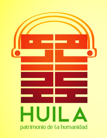
As I don't understand the brief, I would expect the logo to be obvious but it is not. I have no idea what company is this for. The symbol is crowded and I don't understand why would you have the company name twice in a logo. Because in the symbol it is not readable? Well, if you don't find it readable (and you are right), than why don't you just work on it?
Generalmente, la decisión del nombre comercial debe tomar en cuenta, en medida de lo posible, su eufonía y su usabilidad en varios panoramas culturales, de modo que la marca no vea comprometido su prestigio en otras regiones donde se exponga.
En este sentido, en algunas partes de México huila o wila o uila quiere decir prostituta o mujer fácil.
Claro que antes de proponer un cambio al nombre de su marca le propondría que considerara sus planes de internacionalización y ver si es viable transformar o si es necesario conservar el original.
As I understand this is for a craftwork store from Colombia (don't know if is planned to work right there or worldwide).
My feedback goes in this way: try to keep your brand name as universal as you can, why? this because the meaning of "Huila" in Mexico is for "Bitch" or "whore".
Obviously, he can ignore me if its brand doesn't plan to fly beyond their borders, but, as i read "Patrimonio de la Humanidad" (World Heritage), i suppose he can take it in count.
Hello! Huila is one of the departments of Colombia... San Agustin is a town from Huila and it's famous for its precolombian rocks... If you look for some pictures, I tried to make a ressemblance with the typography.
5 Comments
As I don't understand the brief, I would expect the logo to be obvious but it is not. I have no idea what company is this for. The symbol is crowded and I don't understand why would you have the company name twice in a logo. Because in the symbol it is not readable? Well, if you don't find it readable (and you are right), than why don't you just work on it?
Generalmente, la decisión del nombre comercial debe tomar en cuenta, en medida de lo posible, su eufonía y su usabilidad en varios panoramas culturales, de modo que la marca no vea comprometido su prestigio en otras regiones donde se exponga.
En este sentido, en algunas partes de México huila o wila o uila quiere decir prostituta o mujer fácil.
Claro que antes de proponer un cambio al nombre de su marca le propondría que considerara sus planes de internacionalización y ver si es viable transformar o si es necesario conservar el original.
Un saludo!
Despite needing some fine tuning, it's a very fine logo. It's the first one to grab my attention when I look at all the thumbnails.
Now, if you could keep your description of the brief and comments in English, nobody would feel excluded.
Good work!
As I understand this is for a craftwork store from Colombia (don't know if is planned to work right there or worldwide).
My feedback goes in this way: try to keep your brand name as universal as you can, why? this because the meaning of "Huila" in Mexico is for "Bitch" or "whore".
Obviously, he can ignore me if its brand doesn't plan to fly beyond their borders, but, as i read "Patrimonio de la Humanidad" (World Heritage), i suppose he can take it in count.
Hello! Huila is one of the departments of Colombia... San Agustin is a town from Huila and it's famous for its precolombian rocks... If you look for some pictures, I tried to make a ressemblance with the typography.
Thanks for your comments