Brands of the World is the largest free library of downloadable vector logos, and a logo critique community. Search and download vector logos in AI, EPS, PDF, SVG, and CDR formats. If you have a logo that is not yet present in the library, we urge you to upload it. Thank you for your participation.
Version history
Version 1

- I
- S
- T
- C


3 Comments
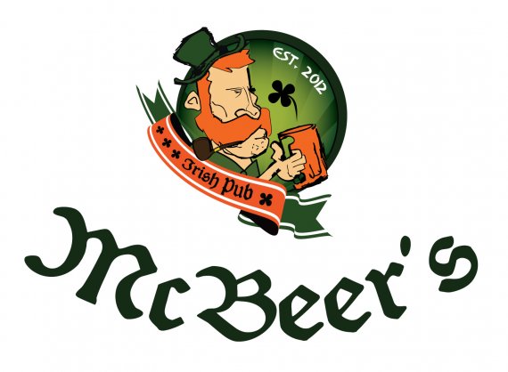
Too complex, especially with the illustration. Hard to read.
It's a really fun idea, and if it were an illustration page I might give props for the little dude- but this isn't a good logo. WAY too complex, too much going on, the font is too small (the font in the symbol, that is), and even if this was a good logo I'd have to mention something about the orange banner matching the beard so closely that they get confused- and I wouldn't want the banner off to the side like that anyway, it just feels/looks wrong.
But that's neither here nor there- this is far too complex! Start over and think simple! You want something that can be on a napkin, on a glass, on a banner, etc! Simple can still convey an Irish good time bar!!
I like the feeling of this logo a lot. What I don't like is that it's too crowded and there is no "most important" part in it. You should make the guy a lot bigger, let him be in focus. The company name is too large compared to the symbol, you need to rethink that. Also you need to pay more attention to the kerning, you can't let that s float in the end like that. You also shouldn't be using 3 different font types in a logo. You should spend more time with the composition, now the whole thing is falling apart.