Medi Dulces
Emanuel Cruz | Thu, 06/04/2015 - 03:18
Brief from client
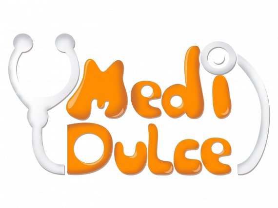
Medi Dulce, virtual and physical store of delicacies, the client is a doctor who wanted to have their candy store, I wanted to reflect medicine with sweets.
If you have constructive criticism to add the saber appreciate


8 Comments
Remove a gradient, please. Make a medical equipment clearly visible and recognizable at first instance, as for now it looks colorless silicon thing. Pay attention to a " D ", it is not uniform with the rest. I don't like how " M " and " i " being bother and disturbed. Also, a tube is cut off badly and looks weird. Maybe you can consider to create a mascot of some sort to make this concept more appealing? I like the warm honey color on a typo. Good luck!
I use color to suit the client, and values to give elegance to the logo, thank you very much for the comment not understand what to Remove a gradient?
A doctor who wants to open a candy store? What's next? A yoga instructor opens a steak house? That's really weird.
Now, this logo is a mess, unfortunately. The "custom" type is all wobbly (not in a good way) and generally poorly thought through.
You really don't need to have any hint that the owner is a doctor in it. People would think it's a kind of weird pharmacy and would go on their merry way.
Also, remove all these terrible gradients and hellish drop shadows.
In fact, remove everything, start over and forget about the doctor/candy combination.
Good luck.
the client asked me so with that combination of medicine and sweets
Strange combination, medical - sweet.
Cesar, that was hilarious - I couldn't stop laughing. Thanks.
nothing in your design shows that this is a candy store,
plus the design looks very weak overall. the text doesn't work! also avoid gradients at all cost!
Agree with most of above, but was thinking about making the stethoscope out of candy pieces? Simplify your typo and focus on that medical/candy icon.
This logo could have a really fun crossover icon that merges two things that most of us would never put together. That is the direction I would play with.
Good luck!