Midland Oral and Maxillofacial
FleepFlorp | Fri, 09/01/2017 - 22:13
Brief from client
The business is an oral and maxillofacial practice, and they wanted it to reflect that. They were adamant that the acronym MOMS be used.
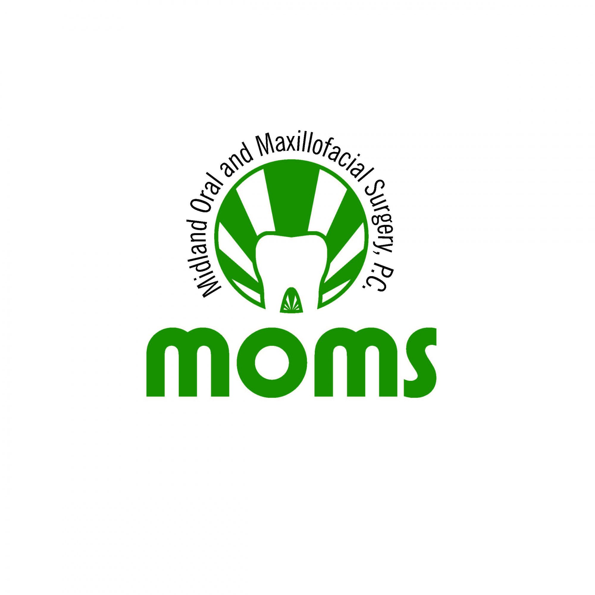
Tooth and rising sun behind it to show uplifting, cheerful
8 Comments
Sorry, I'm not feeling this logo. It looks bland and not too inspired. That green all over is pretty dull and makes the whole thing look cheap.
That white molar is visually getting killed by these dense big sun rays.
The font also looks pretty cheap and the "subtext" is way too complicated to be included in the logo.
As far as the subtext, what would you recommend then? there are plenty successful logos that have the subtext that circle around a logo, what makes this too complicated?
uuuuuuugh.
I'm just going to come out and say it.
I don't read the black text until last. All I see is the word "Moms", with a vector (that I now realize is a tooth) of what looks like two humps in the air on legs, almost like someone is bent over.
I think this entire execution needs to be rethought.
Yep.
Oh, and
This is relevant how?
I'm not criticizing you, just making a little joke.
Isnt the subtext suppose to be read last? Should that not be the hierarchy? Also, as far as the name and logo goes, isnt that what you are suppose to see? is the name of the brand, and its logo? then read the subtext?
The bent over part is a little over exaggerated i feel, but i guess i could vaguely see it, but its feel like quite a far shot.