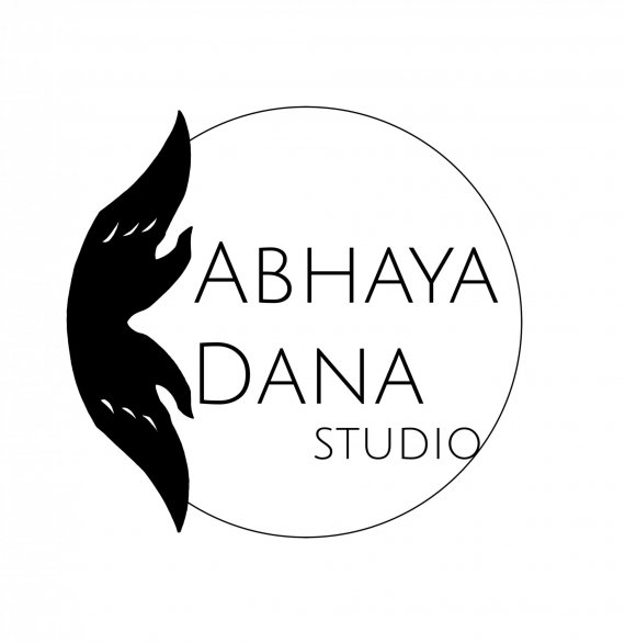
Minimalist Design/Art Studio logo for stamp/embosser
Brief from client
Abhaya Dana is a contemplative design and fine art studio working in watercolor and black ink, primarily, and focusing on Buddhist iconography, specifically Buddha Mudra (or hand gestures of the Buddha) to connect people in the form of personalized handmade gifts, in particular.
Naturally, the artist draws inspiration from classical buddhist art as well as modern art and geometric abstraction.

The two terms in the name Abhaya Dana can be translated as Fearless Gift (Giving or Generosity) or Gift of Fearlessness (as in to give trust and safety). The two terms also refer to two prominent mudras, often depicted together and here fused into a single shape to symbolize their profound connection.
This logo has been simplified from a watercolor lotus bud version for possible use as an embosser and/or rubber stamp to brand made-to-order products - as in products already sold.


5 Comments
I don't dislike the concept, but the symbol looks so rigid and forced. Also move studio away from the edge of the circle.
Hi there, cooperads. Thank you for your feedback. It sounds like your impression of the symbol specifically is that it looks forced and rigid. That's definitely not my intended result and if you're open to sharing, I'd super appreciate deeper, helpful insights about the specific elements that seem to have produced that impression for you, please. Thank you.
I hope it's alright to offer feedback on your feedback, and if it isn't, please feel free to disregard the following:
Pretty barebones, leaning towards discouraging and unsupportive. I appreciate the economy but nevertheless doesn't establish trust and the lack of supportive insight has left me "in the dark". The feedback started off stating, essentially, ambivalence about the concept, failed to provide supportive insight / establish trust and then told me to do something, again without saying why that would be meaningful; leaving me generally disinclined to follow the single bit of advice provided. To be frank, I would not seek your feedback first.
I hope this is helpful in improving your feedback! Thanks again. Best wishes.
Sorry you didn't like my comment. You are an art studio professing contemplative design. I don't see that in this logo. I would be curious to see what other designs you came up with before you landed on this one.
The hands/lotus are mirror images, that suggest rigidity to me. I can't see it any other way.
I am not ambivalent about the concept, but the graphic element on the side doesn't work. The circle concept is fine. I like the lettering. I just can't warm up to the design element.
Hey, bring the attitude down a few notches, please. You come up as uppity and condescending. You've posted your logo here to get some feedback. You got it. You may have thought your logo was great, well, it's just isn't. Boohoo...
I find Coop's comment is fair, on point, and factual. Giving feedback on feedback is just pointless and petty. If you are that much sensitive to criticism simply do not post anything here or don't even work in that business.
I have no idea what your symbol represents. It looks like a badly drawn mustache, you've clearly duplicated the shape and mirrored it, which makes it look lazy.
Also, this big black thing doesn't match with the super-thin wordmark. It makes the composition very left heavy and takes all the focus visually.
Globally, I find this logo very poorly thought through. You need to spend more time sketching out ideas, compositions, etc. I can sense you have an eye for design, but you need to put more work into this logo.
im sory, i think that ypur logo have many things that need to be fixed