mj
equie | Tue, 05/29/2012 - 05:19
Brief from client
Hello I'm testing options for my logo, this is one of them I am a graphic designer, I hope their views. Thanks :)
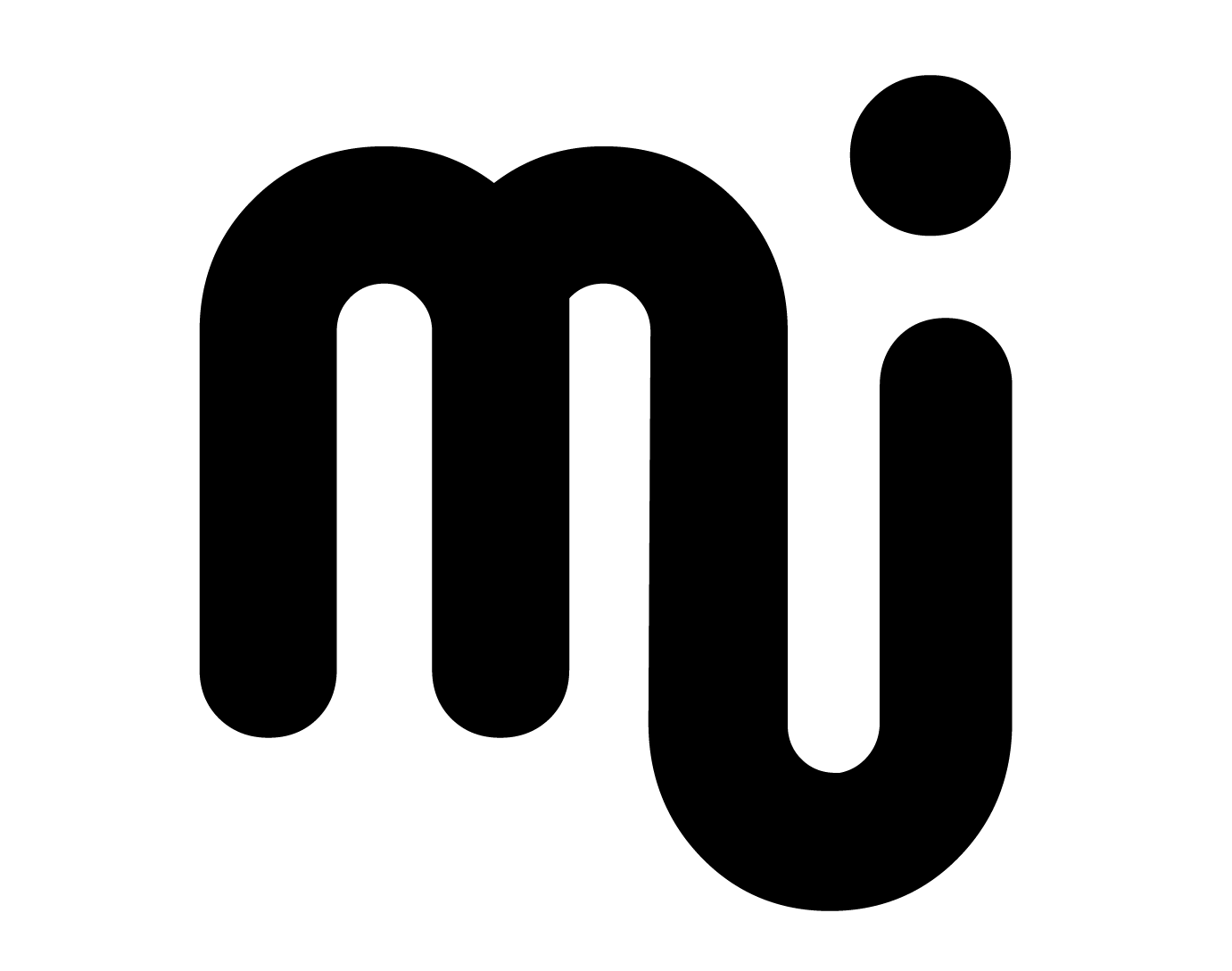
cambie el juego de tipografías siguen siendo mis iniciales MJ
Hello I'm testing options for my logo, this is one of them I am a graphic designer, I hope their views. Thanks :)
cambie el juego de tipografías siguen siendo mis iniciales MJ
9 Comments
If the logo is meant to say 'mi' or 'mj' the idea is there. Still needs delivering properly. Some may read it at 'mj' some 'mi'. I see it as 'mi' at first glance myself.
No colour? No real reason why you've done it like it is? Sorry I cant really judge this on a mere two letters joined together with no meaning behind it.
Hola, trato de que el logo funcione en blanco y negro primero para luego darle vida con el color.
MJ Son la iniciales de mi nombre, casualmente mi nombre completo esta compuesto solo por "m" y "j" me identifican totalmente ademas lo herede de mi mama y mi abuela, por eso lo valoro tanto... mi empresa es una firma personal solo puede llevar mi nombre
This concept works much better than your other one. Get some colour too it, it's what makes a brand.
You're getting there, but the letters are still difficult to read. The type is also dated. Try a sans serif.
That is a Sans Serif font....
I like this one, plain, simple, and it says MJ!
This one is your best till now. present us the color version.
That is way better. Still needs some fine tuning, though. For the J, I would make third arch to the M and twist it upside down and add the dot above.
This ones pretty clean and interesting but from your first versions its up there....