Montcraft - Vintage Racers
santosmont | Thu, 01/09/2014 - 14:20
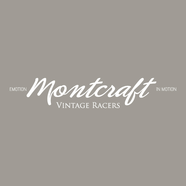
Brief from client
Must be clean and stylish
Easy to read and identify
Vintage style
Any comments will be very appreciated indeed. Thanks for watching.
Must be clean and stylish
Easy to read and identify
Vintage style
Any comments will be very appreciated indeed. Thanks for watching.
7 Comments
knock off al the sublines.
if really needed then choose an other font and position.
Think u hit it, like the ur main font and the subtext but i think the third font at both sides is to much!!!
Just keep it clean and use max two fonts !
I like the font selection for "Montcraft", but the connection between the "o" and "n" really bugs me. The flow of that line looks like it changes directions and lacks real fluid movement, with too much space between those letters, especially compared to the rest of the word. Tighten up that space, and finess that line and it'll look much better.
I would change the font for the "Vintage Racers" subcopy. Trajan is terribly overused, and really doesn't go well with the script above. Something without serifs, not too decorative. Actually, the font you've used for the other subcopy might work well.
And yes, I would drop the "emotion in motion" slogan altogether, or find a better way to integrate it. My eye jumps around, trying to find a focal point.
Other than that, I'd say this is a very good start. Polish it up and see it shine.
I think that the main font is really good, the second is ok, but the texts on the sides looks weird, and three different fonts in one logo is way too much.
I like this logo over all, but I think the subtext on both side has to go. It extends the logo needlessly.
I agree with Trajan being a bit boring. I would go all caps for that text. I can't help but feel that the capped first letters unbalance the composition.
I agree also with the ligature between the O and the N.
good!
"Ligatures"... yes, that's the word. Couldn't think of it. Thanks, Shalawi!