Brands of the World is the largest free library of downloadable vector logos, and a logo critique community. Search and download vector logos in AI, EPS, PDF, SVG, and CDR formats. If you have a logo that is not yet present in the library, we urge you to upload it. Thank you for your participation.
If this is something in progress, I strongly suggest doing all your sketching on paper rather than directly on the screen.
Also, a hand made typography can be really cool but as long as you know what you're doing. Typography is a mix of science, engineering and art and shouldn't be done willy nilly if you want your logo to look good.
Also quick pro tip: have you word mark go from down left to up right rather than the oposit. It will give a more positive to your composition.
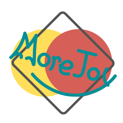
I'm not sure what these circles and that square are supposed to represent, but for simplicity's sake, I would remove one of them if not both. These circles make me thing of Mastercard.
Master Card immediately comes to mind. too many lines in too many directions. It makes the presentation chaotic and difficult to read. Work it back to the lettering and keep it simple. Fortunately, your lettering is the best thing you have going here. :) Also, think forward when it comes to colors. If the logo can't function as a one color version, you're going to run into issues down the road. Start with one color and branch out later.
Life is strange these days. lol But thank you. I miss contributing. I just haven't had much in the way of logo design opportunities that weren't for someone small town minded with no concepts of marketing. Hoping for something fun soon!
4 Comments
If this is something in progress, I strongly suggest doing all your sketching on paper rather than directly on the screen.
Also, a hand made typography can be really cool but as long as you know what you're doing. Typography is a mix of science, engineering and art and shouldn't be done willy nilly if you want your logo to look good.
Also quick pro tip: have you word mark go from down left to up right rather than the oposit. It will give a more positive to your composition.
I'm not sure what these circles and that square are supposed to represent, but for simplicity's sake, I would remove one of them if not both. These circles make me thing of Mastercard.
Keep it up!
Master Card immediately comes to mind. too many lines in too many directions. It makes the presentation chaotic and difficult to read. Work it back to the lettering and keep it simple. Fortunately, your lettering is the best thing you have going here. :) Also, think forward when it comes to colors. If the logo can't function as a one color version, you're going to run into issues down the road. Start with one color and branch out later.
And welcome back. Again. Don't be a stranger ;)
Life is strange these days. lol But thank you. I miss contributing. I just haven't had much in the way of logo design opportunities that weren't for someone small town minded with no concepts of marketing. Hoping for something fun soon!