Moulin de Lecq
M@ | Wed, 04/08/2015 - 11:55
Brief from client
no brief, just that they need an update and all there signage is old and needs replacing.
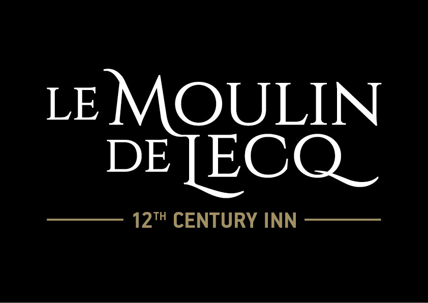
So as far as i know the client likes it but has now decided that it needs to have "Le" added before the rest of the text.... nightmare!! I think my solution works though, what do you guys think?
10 Comments
I like this, but I am not fond of the type for 12th Century Inn. It feels too clunky to me. Perhaps something with rounder letter forms.
I didn't even notice that you added "le". So yeah, it works pretty well.
BTW, what is this specific font?
heres the font Charlie http://www.fontsquirrel.com/fonts/cinzel
If I didn't know any better, I'd have identified it as Trajan..
haha it does look like Trajan, but i think its a better version of it
i really like it ! the only thing i could add is, i am not sure i like the M touching the L but that's just my opinion :D i think the colors work together, the font aren't too bad! i just discovered i had cinzel in my font list haha i just never used it
good work !
I like it very much
very good job! typography and style were very cool. Just need a little better in the symbol.
visit and your suggestion in my work ...
http://www.brandsoftheworld.com/critique/layout-idea-design
I like it too. It's more balanced with "LE" in front of it.
Good contrast, and the subtle gold lines and text work perfectly.
The connection between M and L does look a bit too much, seeing how every other letter is very well individualized and spaced from the others.
Thanks for all the nice comments on this. The client loved it! :) Here is a pic of one the many signs ready to be fitted... the matte black vinyl background works really nicely with the Gold and white gloss vinyls - Very pleased with the way this project worked out! :)