My Company name
AngelDrago | Sat, 09/26/2015 - 15:03
Brief from client
This is a logo designed for my It Company
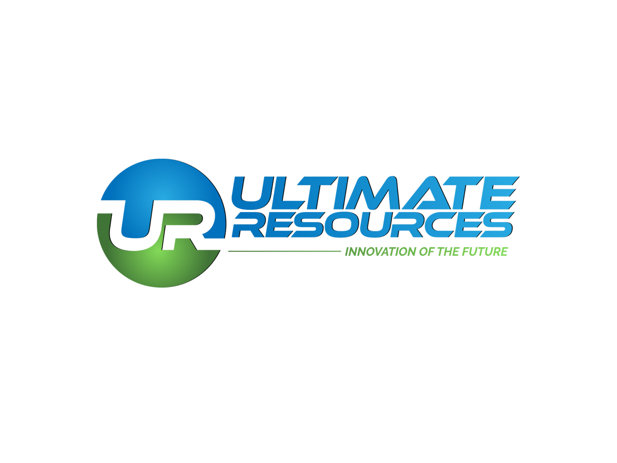
I paid an designer to get me a logo for my startup IT company and before i release it i would like to get all of your feedback and input for this logo.
10 Comments
I could think of better ways of combining "u" and "r"...
::wink::
All jokes aside, this looks good though I would move the text slightly more to the right and gove the icon some space.
Thank you for your input this will help me a lot to make it better.
I like the symbol and the colors. The main font is too sci-fi for a professional company. I would suggest a simpler more traditional font to portray your company as solid, established.
Sorry to be the party-pooper, but I'm really not feeling this one. Ask your designer if he didn't get a bit too inspired by the old Stumblupon logo, because this one is definitely too close for comfort.
I agree with Fred on the main font being way too sci-fi for a serious business. Also, that kind of drop shadow is a big no-no. I would tell the guy to make a logo that can work without the subtext.
Good luck!
Well that one snuck by me.
Thank you Shawali for pointing this out to me and i did a research online for the old StumbleUpon logo and i found it and i submitted it to my designer than he intimately refunded me the money. I'm a bit disappointed. I can not afford a lot of money in a logo design as I'm starting out. I don't have the skills to design my own logo.Back to the drawing board ...what a drag....:(
Here is another one from a different designer....
That's a terrible logo. Looks like it's been made in 2 min. Find a real pro. There's a whole lot of them here.
Thank you, Shawali i tough so too and i told her that as well here is something after a week that i got from her
Make a new post with it (click on "post a new version" in the upper right area.