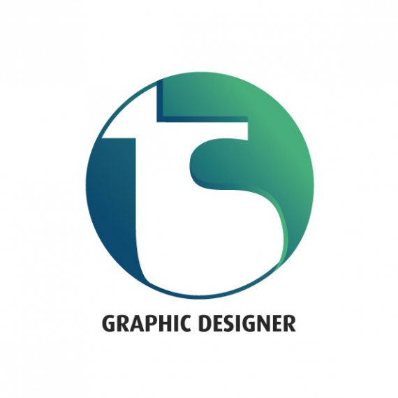
My Design
TommySkills | Tue, 02/25/2014 - 04:16
Brief from client
This is a design for me to use on upcoming business cards and websites.. I want something modern that will stand out and look clean.. The 'T.Skillen' are my initials..

Slow day at work so put this together in my lunch break after refering to some sketches I'd done in my diary..
The initials read 'ts' let me know if you can make that out clearly..
Anyway instead of giving a brief about why I chose what let me know as a audience what you think of this direction, I'm looking for some really good critique to help me to develop the logo into a final version..
Thanks guys!


5 Comments
I didn't see the "ts" until I read your description.
don't use gradients
try to make a well made circle (this one is broken at the bottom)
rework the idea of TS, it's illegible
If you want to use your initials, I suggest you Google 'logos with initials' to get some inspiration.
The letters T and S are going to be tricky to marry nicely, as the T is very straight and the S is curvy. There's no natural join with a traditional font, so I agree with abstracting it as a solution, but what you have done is not legible.
I would also look at square and unusual fonts.
Yeh i've had a little look around but unfortunately I wasn't born with good initials haha ..
I'll have another crack at it when I have a free moment, Cheers on the advice mate
Another thing I noticed is that your bevel is moving in two different perspectives. You can see this where the top of the "S" and the cross of the "t" come together. Keep at it.