Brief from client
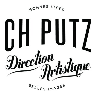
Hey there. I had some time to kill this week end, so I worked on a new personal logo.
I want for the full on vintage style which I'm totally obsessed with =)

The text says "art direction, good ideas, nice images".
Fonts used are Knockout, Buttermilk and Gotham.

18 Comments
And here's a first draft for my b's card.
Well I'll give you all thumbs up, but there are some issues. 1. If the "CH" is for Charles, to be in period it would be presented as "Chas." 2. The kerning on "CH PUTZ" looks a bit forced. Other than that, this could be a title for some sort of elixir or the title of Moulan Rouge. Good job.
The CH actually stands for Charles-Henri as well as Charlie. But putting dots would uneven the whole thing.
What do you mean by "the kerning is a bot forced"?
Anyway, thanks for your remarks and appreciation! =)
It looks good, but when characters are spaced far apart, the regularity of their spacing starts to look artificial. No big deal.
well, you didn't killed the time, you did something fantastic :D. Very nice job there, I like all of them.
i like it but for me its almost like its just 4 different bits of text arranged nicely.. It looks like a title you would have on a film poster or something.. maybe this is because you have your name and then 3 more different things (Bonnes idees, Direction Artistique and Belles Images) think it would be better and more refined if you just had your name and the one bit of subtext to some up all those 3 things. I would also like to see a really nice symbol to go with it which you could use on its own as well. I hope this doesnt sound harsh as i do like the overall look and i to love the retro/vintage style. Just think you need to make the whole thing more refined-simple
Shawali you're definitely in your element with the vintage style logos, I was hoping that you'd post a few sooner or later!
The issue with font has been addressed, but in all I don't have a serious issue with the amount of fonts. It looks like you have 3 different fonts, which all work great together but I can see where 2423 is coming from with a possible confusion on what "CH" would mean.
I personally think phonetically when I see a word I don't recognize, so for me CH PUTZ spells as "ChaPutz" with a missing "A", which despite that it may be a cool name for a logo, I doubt you are aiming for people to pronounce it that way! LOL
One thing that may help is if you use some color, maybe coloring the C and H differently so you wont have to lose your balance with adding dots.
That's the only problem I see in the logo, other than that its awesome! Even though I too second that there can be a little symbol or minimalistic graphic to tie it all in - but I don't think its needed :D
Ok, I see what you mean about the ambiguity of the CH. I'll try adding the dots.
About the number of fonts, I know I'm the first one to advise to stick to no more than 2 fonts. But I use gotham, a cool but plain font, for the "sub sub text". So think it's find as it is. Again, if you have 54 fonts in your logo but the final result works, the why not? =)
Thanks for the comment guys, it's always helpful =)
Charlieeeeee!!! Do I even have to say it? (I love it!)
Here's a version with the dots. It may work better indeed.
Shazam! Looks like we have a winner :D
Yes we have a winner!!
HAHA I LOVE IT the dots did add the finishing touches as well as the "-" on the -Bonnes Idées- nice work.
Indeed!
Everything's said! Good Job!
Great Retro image!
I think you use too many kinds of fonts. Also the parts of the text are too far from eachother, the logo should be more compact.
It's a bit boring too much typo, symbol loses his power.