N A N I . Beauty Spa Honolulu, Hawaii
Marjorie Reyes ... | Mon, 05/09/2016 - 15:41
Brief from client
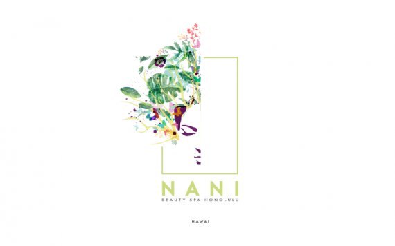
Spa , beauty salon where they specialize in skin care , I wanted to reflect a friendly , close , soft brand and entertaining time , representing diversity of their services , fresh colors own place..


5 Comments
Well, Hawaii is misspelled!
This is really complicated for a logo. It might make a pretty flyer or business card, but not a logo. The arrangement is odd too- those purple pieces just floating their by themselves especially.
I would focus on a strong logo first. For other applications, you can add the flower elements (as mentioned a business card, flyer, mailer etc.)
But keep the logo simple.
I don't know if those flowers are vector or raster- but DO NOT include photographic elements into a logo. It's just bad in so many ways!
Good luck!
Holy crap I just now saw the face! ( I guess that explains the purple pieces lol)
Oh! It is a face. I had no idea until you told me.
So yes, this is too complicated!
ajjajajaja xd yes! thanks!
I think if you're right , though that was what was wanted to give something messy diverse and dispersed , and yes, everything is vectorized , Thank you for your comment :) oh and this hawaii written in Spanish that is "hawai", by spa roots are Latin , take into account , and thanks again !