Nadando de Muertito
Valhall | Mon, 02/24/2014 - 22:21
Brief from client
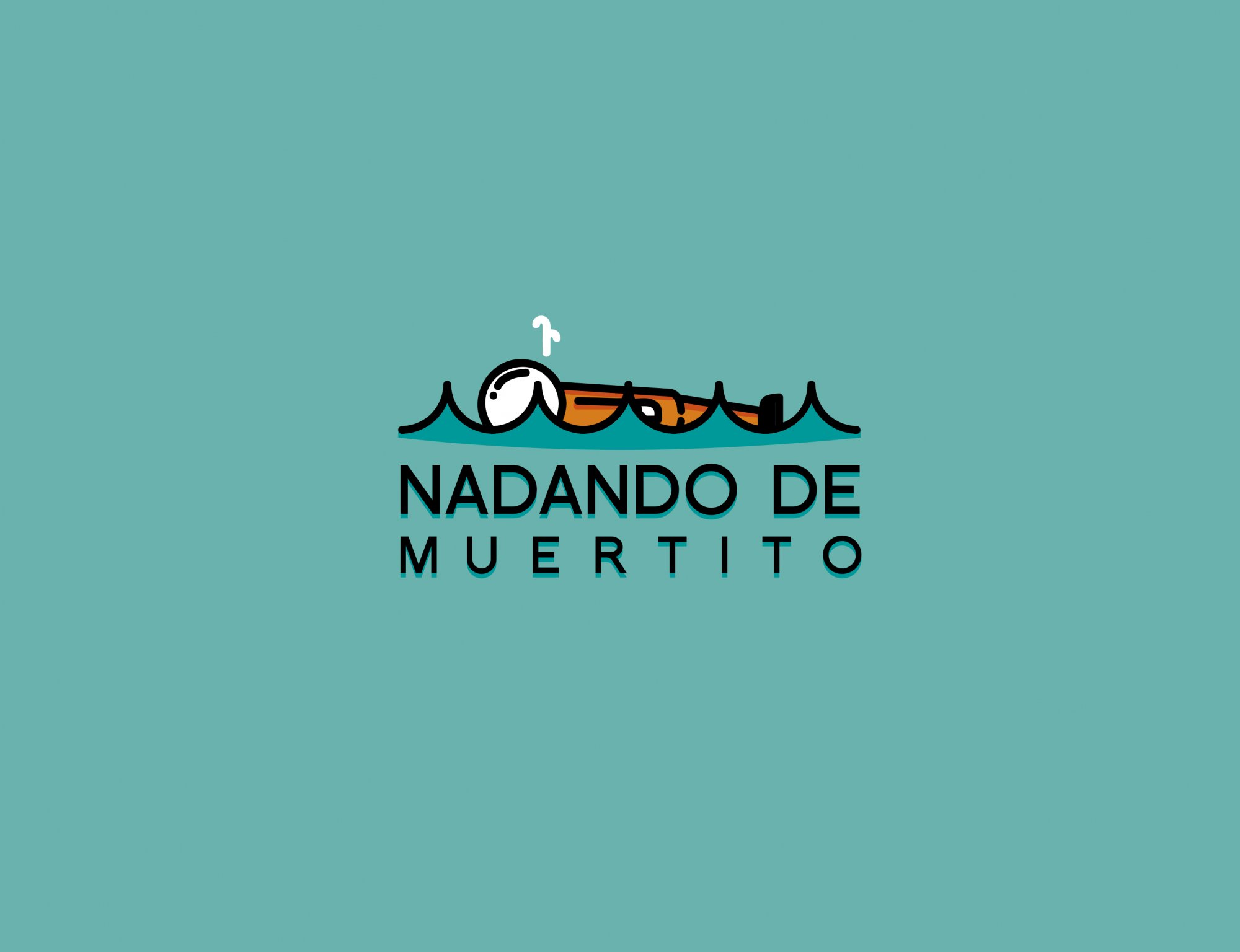
Andando de Muertito is a Group of Mexican Designers. We chose the name cause it means "follow the flow without effort" something ironic in our culture and really utopic.
8 Comments
Looks great! Well done! The only thing that is probably bothering me is that white "sprinkle" coming out of the mans mouth. Perhaps make that black?
All in all good work :3
I agree, this logo isn't logo bad at all!
Maybe the waves are a bit too accuentuated and pointy.
I agree with Giga on the sprinkle thing.
Good job.
First of all I love the idea! This logo is very well done! :)
Good job! i think you need to change the font to something rounded to match the style of the symbol. The symbol has nice rounded corners and the font is sharp, these together don't match. I would take off the small turquoise shadow behind the text as well and im not sure about the turquoise fill in the waves, it looks a bit odd how its finished with a curve but the text underneath is straight.
A few tweaks and i think your there!
ill also add that i found it really difficult to make out what the object on top of the waves was.At first i thought it was some type of submarine or pen! I think you need to make it a bit more obvious that its a person floating, maybe put an eye and a smile on the face :)
Thx Ill try that and see how it look
I can't add anything that hasn't been said already. This logo has personality. Awesome job!
Great work!