NAPSA
G13Design | Thu, 11/17/2011 - 03:34
Brief from client
NAPSA works to improve the welfare of captive primates in north america.
#1 - Protecting Primates
#2 - Unity
#3 - Professionalism
Some of the most common primates in sanctuaries are chimpanzees, capuchins, macaques, baboons, marmosets and gibbons. Perhaps, the shapes of some of these primates could be incorporated into the logo. If this route is selected, a chimp should definitely be one of the primate shapes. Although membership will eventually be open to all primate sanctuaries, NAPSA was founded by the directors of seven organizations caring primarily for chimpanzees.
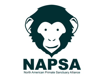
North American Primate Sanctuary Alliance
5 Comments
I like it, it's clean & professionally executed.
I might have went for a warm & happy monkey image but that really depends on what kind of image your client wants to achieve.
If they want to be perceived as a serious professional organization then you are on the right track.
Here is an example of what I meant by warm & friendly look:
The mouth looks strange. The top of the head and the ears are drawn a bit hastily they look funky (in a wrong way :). The eyes could be a little bit bigger, chimpanzees eyes are lively and very characteristic. The tagline is too small.
It is a good start, keep working on it!
I like it, it's simple and gets the point across without any fuss. I would look at the strap line though as I have to agree with Sensed that it's a bit too small. maybe consider an extended font for 'NASPA' which will allow you a bit more room for the strap line.
This is a great subject. You must be able to do something better than the obvious. Think harder!
Too obvious...