Brands of the World is the largest free library of downloadable vector logos, and a logo critique community. Search and download vector logos in AI, EPS, PDF, SVG, and CDR formats. If you have a logo that is not yet present in the library, we urge you to upload it. Thank you for your participation.
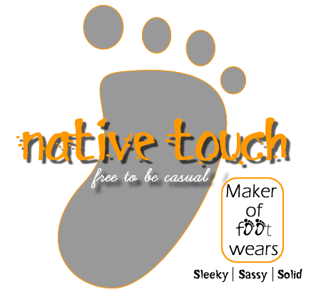
i think thats good idea to make footprint as a symbol, but the compotition isn't good, how if its seen in black and white colour? maybe you can blend the symbol of the foot print become 'O' from word 'TOUCH' so that logo have centre of interest. and for the typo, i think you need to improve it little more.
Yeah, idea not bad, but try to remove lots of the typography - like the "free to be casual" says it all. I would remove the "maker of..." -block completely, as well as the sleeky sassy solid - text - and then get the whole thing into proportion. Colors good, but I agree with the outline as mentioned by geracao.
I think you have a good base to build a good logo from.
Maybe try to use a foot symbol in the O that would be a great touch,
Take out all of the unnecessary type, Take off the strokes they just make it even less pleasant on the eyes. The colors are hard to look at as well.
Good start take notes from the comments, and i think you could have a respectable logo!
6 Comments
i think thats good idea to make footprint as a symbol, but the compotition isn't good, how if its seen in black and white colour? maybe you can blend the symbol of the foot print become 'O' from word 'TOUCH' so that logo have centre of interest. and for the typo, i think you need to improve it little more.
hmmm... ok i like the idea, not the symbol. first of all remove de outline... then try to do something diferent with the foot, i agree with xanero
Yeah, idea not bad, but try to remove lots of the typography - like the "free to be casual" says it all. I would remove the "maker of..." -block completely, as well as the sleeky sassy solid - text - and then get the whole thing into proportion. Colors good, but I agree with the outline as mentioned by geracao.
Not an idea. The illustration isn't pleasant. Typography too complex. Sorry, nothing works here so far.
scratch this and start fresh. i don't think this will lead to anything, try rethinking the entire concept.
I think you have a good base to build a good logo from.
Maybe try to use a foot symbol in the O that would be a great touch,
Take out all of the unnecessary type, Take off the strokes they just make it even less pleasant on the eyes. The colors are hard to look at as well.
Good start take notes from the comments, and i think you could have a respectable logo!