Natural Ice Cream
BuburuzaEis | Fri, 05/30/2014 - 09:42
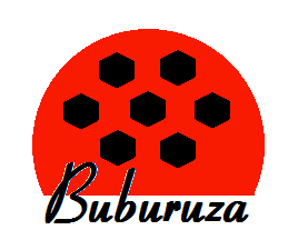
Brief from client
Start up Business mainly for Natural Ice Cream, direct selling, but should be expandable also for further pastry products, e.g. ginger bread houses in winter season. Buburuza means "Ladybird", the logo represents in the same time a coup of fruity ice cream with chocolate pieces. The brand name should indicate the legs of the ladybird.
3 Comments
Wow someone just found paint on his winXP computer. (Be careful they are not updating it anymore ;)
Sorry but this is very bad, the font is horrible and i have no idea what that symbol is (even when i read your description)
Start sketching first and get inspired by the internet.
Succes!
this one has potential but for the moment there's no pancake mix in there. Make the font rounder and more fluid give more personality to the symbol. Something like this may help you better http://www.fontspace.com/fontscafe/marmellata-jam-demo....
This design screams more "ladybug" than "ladybird."
I just don't see any real thought process in this logo. It looks like it was the first thing you thought of and decided to go with it, instead of giving it some time to come up with something completely unique.
Do some research on logos of the same field (without plagiarizing). Do research on typefaces also and try to come up with a logo that meets your needs, but stands alone in your field.