Need Feedback
Brief from client
Logo for a YouTube Reaction Channel, for an older Australian.
The name of the brand is "Guarded Relic"
Themes Australia, Youtube Reactioner, name "Guarded Relic".

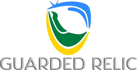
Colours choice are common colours associated with Australia; green, gold, and blue.
Colours are layered with blue on top representing brilliant cloudless skies.
Then there is green in the middle representing the lush greens of the rural landscape.
Finally, gold is on the bottom and represents the golden sands of Australian beaches.
Shapes are layered similar to the colours used in this logo.
The blue shapes at the top form parts of an old television set, highlighting the themes of the device to watch episodes on, and style of an older set which is a bit of Relic in this day and age.
The green shapes form a comfy chair to watch the television set from.
At the bottom is the golden arc that forms the bottom of a shield, liked its guarding the other parts of the logo.
The negative space between the blue and the green shapes forms a watchful eye.
By following the outside of logo around the outside then nipping in the gap between the blue and gold shapes, and over the green forms a capital "G".
The upright part of the green shape forms a capital "R".


2 Comments
Hi!
Props to you for giving significance to you logo butI think you've overthunk it ;) You try to symbolise too many ideas and in the end, the logo fails to deliver a simple and memorable idea.
There are several good or potent ideas in that long list. You should try to keep one or two tops and focus on them.
The key word here is SIMPLIFY. A simple logo has better chance to leave a lasting impression. But don't mistake simple with simplistic (not should you mistake complex with complicated)
Remember, this is for a YouTube channel, where your logo will most of the time be quite small. Having too many signifiers in it will make it quasi invisible among all the other logos, icons, pictograms, etc.
You need to get rid of that terrible bevel & emboss effect on the word mark. It doesn't being anything good, gets in the way of legibility and looks cheap as hell.
You obviously got a knack for conceptualization. Just keep things simple and streamlined and you'll get there.
Keep it up!
Thank you Shawali,
I'm not arguing with your comments, just want to add something and remove three things.
Removals:
The negative space and incorporated initials were by-products of the design, not a conscious element, and the font is just a place holder. I should not have added them.
Addition:
The logo is for static use but was designed as part of an intro animation. The animation starts with a gold-shield, green chair, and blue television that crash or merges into the logo.
I think in terms of the story of animation for the logo.
Alternately now reducing to three elements, for simplifying the logo is removing the gold arc, and the animation is simplified to television on-screen, then stick figure runs in leaps into the television and as the bottom corner of the television stretches to accommodate the weight of the figure into the shape of the chair, and pulls the top of the television out of alignment (logo alternations to come).
Just badly painting the whole picture.