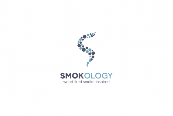
Need unbridled critique
Brief from client
- this logo is for a trendy restaurant in Washington DC, USA. SMOKOLOGY is more than your typical restaurant, it is a trendy, city neighborhood restaurant that serves smoked meats and composed plates utilizing these smoked meats. I don't want this restaurant to be confused with a barbecue restaurant.
I've seen a lot of science influences in restaurant branding and decor lately. The vintage science vibe captures quite a few moods, particularly that of intelligence. Using vintage-styled field guides, entomology, fancy diagrams and lab like looks. I would like to see a logo that has a smartness to it that goes all out science. I think with a little cerebral, a smart logo would help position the restaurant as a authority on smoked meats and other smoked food items.
I am hopeful that you can craft this image, cautiously straying from the over-designed and cluttered forms some science-influenced brands can take. I imagine all this science mixed with some industrial influences inside the four walls and it all comes together to create a very attractive, authentic and honest portrayal of a restaurant that isn't too smart for its own good.
I do like the following in logo design:
--Absence of depth
--Use of simple elements
--Typography- crisp and clear fonts
--Color- I would simply like to see the the logo in mono (black and white) and then color applications later that are slightly desaturated
--Minimalism, simplicity and basic geometric shapes
--Creative uses of negative space

Would like to see an unbridled critique. Please be direct I am thick skinned.
I would like to tie the design together a little more. Should I integrate the icon into the logotype? And, if so how?
Please tell me what you like about the logo and most importantly tell me what you don't like or what needs to be corrected to achieve a better design.
Thank you in advance,
BKH


9 Comments
I totally agree with shanuea....for me the "smoke" looks like water bubbles ore air bubbles under water!
The coulors do not convience me....looks more like as i aid before water ore something medical...reminds me of a cancer clinic! The bubbles look genetic..
I think u have to start from 0 and overwork ur hole thing !
As a logo it has promise, assuming the small circles are addressed, but it really misses the mark when it comes to applying to a restaurant. I don't get restaurant or food at all from this. I like the colors but I don't think they help communicate your subject matter either. More reds browns and grays might be more applicable. I like the aesthetic but this needs to be reworked so it communicates better as to what the business actually is. Best of luck to you.
I think the logo looks aesthetically appealing, but if I hadn't read the explanation, I wouldn't have known it's for a restaurant. If your 3 keywords are wood smoke and meat, red, brown or orange would be a better color than blue.
I agree with previous comments. If I had not read your introduction, I would have never guessed it's logo for a restaurant. Anti smoking clinic comes to mind.
Agree with everything above, it just looks like you are trying to be trendy with this mark instead of creating something correlated to the restaurant.
First thought on logo: E-Cigarette company.
Icon: Smoke is more wispy - its a smooth line with thickness to it. Bubbles are hard to show smoke. Unless there is a theme there we aren't seeing.
- does it have to be smoke? Can you use another part of the "smoking" process to make your icon?
Colors: I'm 50/50 on the colors. I like that blues aren't the norm in smokehouses, but dark colors the traditional.
I think it is the colors that gives the logo a cigarette-company or medical look.
To All,
Thanks for the input. Let me know what you think about this direction.
OR this one.