Brief from client
Redesign de logo.

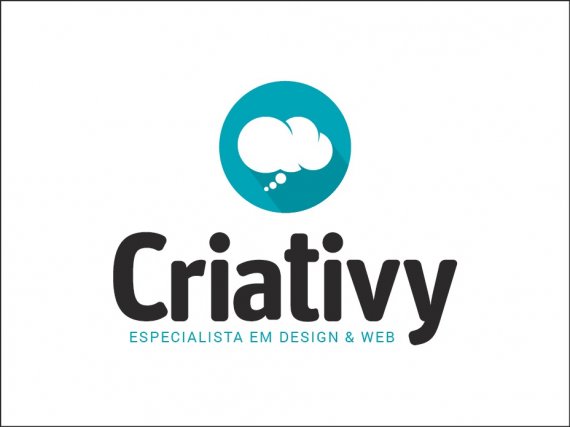
Hello, I decided to summarize the word "Criativity" to "Criativy". Anyway, I created a new version with a another source. What do you think? What about the slogan, think better in lower case as in the first version or in case? And the new writing source "Criativy" best thought this new? Thank U!
2 Comments
Ah breathing room! The kerning on Criativy is better, but it might stand a little more(the v & y , C & R are all really close and causing some tension)
I prefer the subtext as capitalised, but you should have it going from the beginning of the C, to the end of V. Right now its not lining up to those edges.
Good job though! Getting there!
I liked the other font better though. If it is the same font, cause I can't tell in the thumbnail, then make the height of the lower case like you had it before. Kerning is much better. Varansl is correct on the subtext going from C to R.
Have you tried it without the dots on the "i"?