Next Generation Fitness
jaYoung7 | Wed, 01/22/2014 - 18:28
Brief from client
Am in sixth form doing an A Level Graphic Design course, so this is kinda the beginning of my logo design. Design brief is "The firm 'Next Generation Fitness' are launching a brand new chain of modern fitness centres. Create an effective logo that portrays the companys modern clean image".
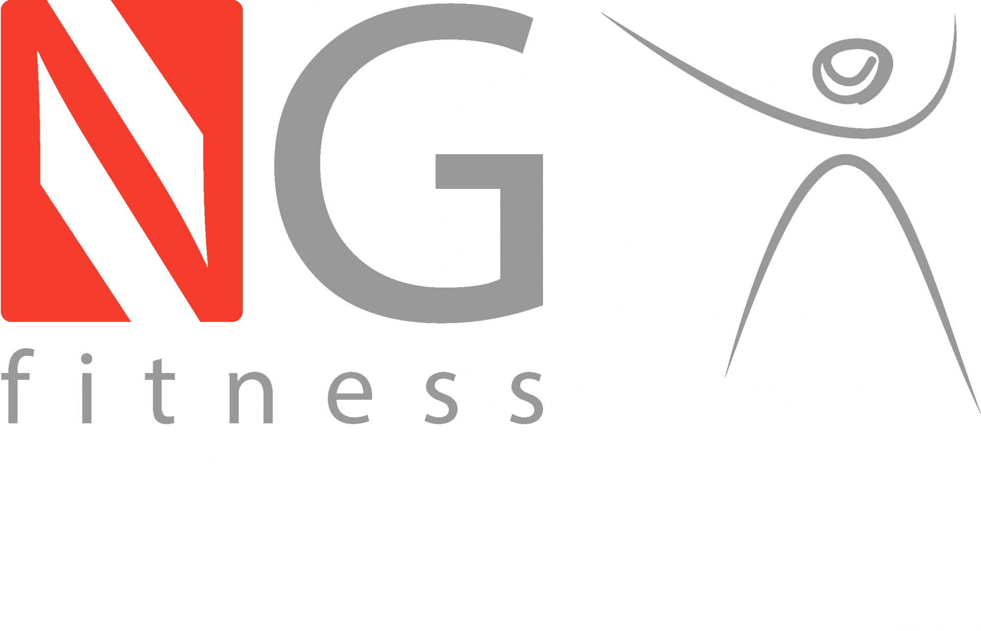
What does everyone think now? sorry, havent implemented all the ideas, and still have two 'symbols' but i think this is better.
Appreciate all your comments, thanks. :-)
10 Comments
The little guy doesn't seem to be a part of the layout to me.
you mean it kinda looks out of place??
you still have the same problem: having 2 heroes in your logo (the character and the stylised N). Have you tried loosing the guy and make the G look like the N?
ok thanks. just that i feel i need something that has a connotation with fitness, like something that people could pick out from a distance and think 'fitness, health, action'. or maybe i dont, what do you think???
Create a grey corner rounded rectangle beside the G, put in it the silohuette, in white, make a little bit bolder its arms and its legs. See it. Then, say if it works.
Darbo
sorry, what do you mean by the shape you described, i cant quite see what you're saying?
jaYoung7, imagine that your logo has to look great both small and big. I would also try to avoid different types of fonts. Play with something one. One font, one form, one color, and see if something good comes out of it. Colors on this one are fine. Below is something how I see your man and the fonts play. You can play out of there, or choose something different, but more strong, unified, appealing to the eye, yet having that 'fitness' idea.
thanks thats helpful. what font have you used there, just as i like it and cant seem to find it.
thanks again
Helvetica BQ Medium. I rounded edges myself. If you want rounded edges already made, then go for Alte Haas Grotesk or if you want really round ones, take Helvetica Rounded. If you go for Alte, its free from dafont.com Cheers.
Nice. The provided logo for next generation fitness is good due to its simplicity. The logo which is shared by Alpreacher is more attractive as you have shared. I think you should used Alpreacher logo. Anyways, fitness is the fundamental element of our life because we can't get success in our life's goal without fitness. For this purpose, i always prefer to used herbs and juices in food as our ancestors used it not only in food but for curing diseases as i have read at desiherbal.info. Anyways, appreciative efforts that you have put to design it and share it with us. Thanks for it.