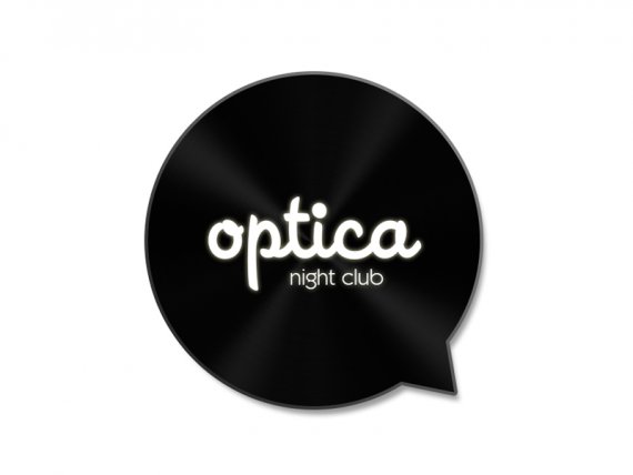
Night Club OPTICA
Brief from client
Optica should be the new name of one of the biggest night clubs in the sixth largest city in Bulgaria. At the moment our team is working on finding the best one night club conception, branding and styling.

Optica should be the new name of one of the biggest night clubs in the sixth largest city in Bulgaria. At the moment our team is working on finding the best night club conception, branding and styling. We want to initialize each night style in different colors. For example all about the marketing and styling of our retro music night in wednesday should be with green elements on it. In friday and saturday we invite famous house music DJs from all over the world and we want to make all our advertises and interior lighting in white gamma. We want to show our clients what is the music style of any future party night if the guest is not recognizable for the clients.
We know that "Optica" doesn't mean anything in english, but yes it comes from optics, optic, etc and it have the same meaning in bulgarian. The main problem at the moment is that we can associate this name with our already finished interior design. We can put optical fibers as a decoration and lighting, but I don't think that they looks pretty good. What do you think if we use this logo design, but change only the name inside with some of these...? Do you like the typography, colors and shapes? Do you think that it looks luxury and chic?
Duplex
Eclipse
LAVO
M1NT
Puro
Pigment
Loft
Harsh
Sobranie
Viral
Fibonacci
Six
Thanks in advance!
Greetings,
Constantin


13 Comments
I like this design a lot but I can tell you right now, you're going to get grilled for the shadow and glow. Try removing the shadow and glow and I would make the shine on the record a little more visible. Nice job, in my opinion.
I totally dig this logo!
It works really well as a "deluxe" version.
Nice, but I would think about losing the shadow. Also, see how it looks with words a bit larger.
nice! I would loose the glow. I like the font.
The tag line looks little tight to me.
Thanks to all for the good words and comments! I will take in mind all your suggestion. Please have in mind that I used glow and shadow only for better presentation as in a mockup.
You can find enclosed incompetent, 5 min Photoshop version made, but I am sure that you can imagine exactly how it will looks...
The speech bubble doesn t work for me, it isn t creative nor unique. But I do like the font.
Thing is, you'll need to have flat version of this logo, without the all the effects and gradients, and which you will use for stationary and anything print.
The optica night club doesn't do only retro party right , then make the logo a "multi purpose one" for all kind of music. If it was me i would keep it simple, remove the effects and the speech bubble (aka gramophone disc), try a word mark logo.
I really like this, seems sexy. My only critique would be to increase the size of the font a bit. The speech bubble seems to large in comparison to the text.
La idea no es Original ... pero excelente tipografía...
Cual es el nombre de la fuente ?
Some thematical minor elements inside the interior and decoration.
This is some point of view explanation
I'm not like the talk bubble. Remember a Instant Messenger App for mobile. The fonts and colors are ok.