nitografik
nitold@yahoo.com | Thu, 10/18/2012 - 20:48
Brief from client
I decided to change my name and logo as a graphic designer. the previous name was difficult to understand and quite long. So I decided to use my nickname in conjunction with a part of the previous name.
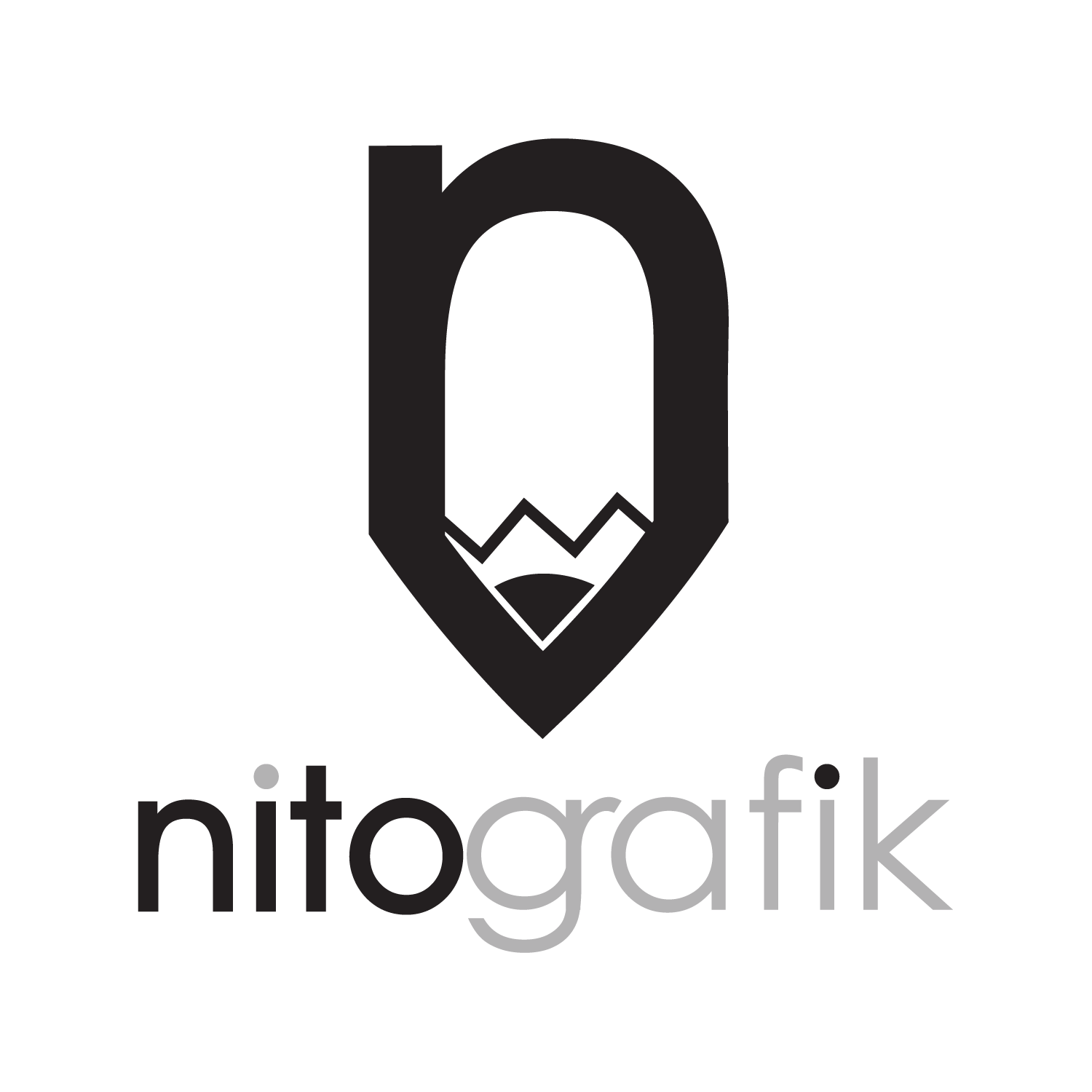
It is very simple first looks the letter "n" from nito and in the in the middle a small pencil that is the part of grafik (as a contraction of graphic)
8 Comments
Nice Symbol.. with the " n "
Sweet JESUS it's nice to see some good design work on this page! I like this. I kinda-sorta wish there were some colors to it, but I'll take what I can get. The symbol is lovely, the fonts are great and I actually really like the two dots on the i's being different colors. Nice work!
Really nice idea with the symbol and the font is ok but it needs another color. My oppinion is that if using black and/or greyscale and/or white another "real" color is needed.
Symbol looks great, but I'm no fan of the font work.
muito bom, apesar da cor cinza ser muito clara, escurecer um pouco a cor cinza , mesmo assim parabéns.
This is great. You're symbol is great! I don't think you need the extra treatment on the text.
Also agree that the font should be just normal font, otherwise you will be confusing us with thinking that it's a symbol - which it isn't. Personally You may want to strive for just a symbol (your logo) and some nice legible font underneath, which would keep the attention on your logo - which is what you want. I don't mind that it's black and white but a little punch of color would be nice.
(Y)