Brands of the World is the largest free library of downloadable vector logos, and a logo critique community. Search and download vector logos in AI, EPS, PDF, SVG, and CDR formats. If you have a logo that is not yet present in the library, we urge you to upload it. Thank you for your participation.
Version history
Version 1

- I
- S
- T
- C


7 Comments
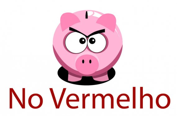
The symbol is flashy then the font so plain?
try to have a balance between the two.
I think you have to many colors going on as well.
Let minimize it to 2-3 colors max
I also think the shadow is to harsh.
I agree completely with Monito- the font is SO PLAIN, especially sitting next to a relatively cute pig. I also agree about the shadow being unnecessary- take it away! I might also just use a black font for the name- the red kind of clashes.
But once you pick out a new font (something friendly looking, piggish maybe?), take away the shadow and change the text from red to black I think you'll have a good start!!
can u give a tip, about which font?
Aww i LOVE the pig, and i hate the typography.
I also agree with what was said. Also I will go further and say to remove the black outlines around your pig's eyes, as it looks a tad unprofessional. Let the dark pink serve as the outlines, as the thin lines around the pigs eyes will get lost in smaller sizes anyway.
Also agree with taking off the shadow. There are two solutions to it though.
You can either take the black shadow out altogether, but if you want to keep it, make it that dark pink color and REMOVE the shading under the pigs belly and legs, so it flows more with the eye and making it HALF the width of your pig to bring less attention to it. Your choice of course. All in all I'm liking this! Willing to see more improvement on it.
The piggy bank is an overused symbol, really boring. A company wants a logo to have a unique symbol that distinguishes them from others and thus using such a piggy clipart makes no sense at all. You can find millions of this piggy bank clipart to download, why would anyone want to be just one of a million. And yes, the font is far from the graphic they lokk like two different logos.
I'd start something new...