Brief from client
The client is a restaurant, bar, & event management company. The company focuses on know-how to train teams & fix flawed business plans.

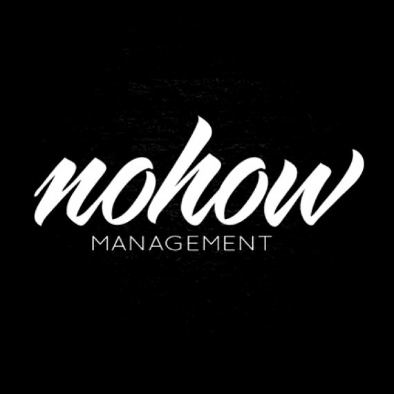
The fact that the logo is handwritten literally suggests the «hands-on» aspect that is a dominant characteristic of «know-how».

6 Comments
Makes sense.. check the centering on the tag though.
I might give a bit of space between no & how.. It took a second to get it because I was trying to read it as one word.
Or they could be 2 different colors if you wanted to get jiggy with it.
Very helpful feedback. Actually I am not crazy about the name either, i will try to differentiate he 2 words with a shade of gray.
And the tag is really tricky cause the logo is oblique, so if it perfectly centered it actually looks lopsided.
Thank you!!
attractive and works...good job
Looks good, but it's easy to forget.
quote!
Thanks for your comment! will try to make it less forgettable through the banding.