NY Tri Expo
OctavioBaca | Fri, 09/11/2015 - 07:32
Brief from client
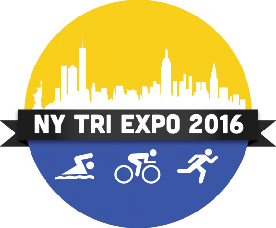
This is the logo of New York Triathlon Expo 2016.

Triathlon Expo is being organised on a large scale.This is suppose to be the one of the big event of the country.From beginners to professionals, everyone is welcomed.Get more info on the official site at http://nytriexpo.com .


3 Comments
Are you asking for advice on this logo, or are you asking us if we want to go to the NY TRI EXPO 2016?
As a logo, there is way too much going on.
The sports icons are pretty rough honestly.
- The swimmer's body is straight above the water.
- The runner has a pointy odd neck and looks like they are from the tripping hazard sign.
- Since they are on blue and under the city, they all look like they are in water. The biker and the runner are drowning.
It is hard to see the ribbon shadows, as everything is so dark, and ribbon shadows are not modern in the slightest. It makes the logo look really dated.
Do you need to use the entire NY skyline to symbolize NY? There is an awful lot of it here. Unless the race goes from the Statue of Liberty to ... that little building over there by that pointy bit that is certainly a famous building... I think there is too much.
The kerning needs to be tightened in 2016, and I am not a fan of the font used. Sorry, globally this is a complete miss for me...
Oh, the colours are nice though.
haha it does seem like he is selling the event and not the logo
i have to agree with Mr waffles, you should rework on your sport symbols.
The font in the center feels too bold.
Next : the colors... i'm not sure i like the yellow/blue/black combination.
(With the blue it looks like all the little people are IN the water)
Overall it needs to be reworked i'd say but don't lose hope!