Brief from client
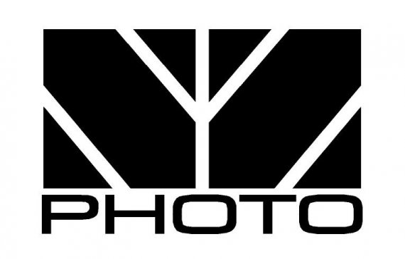
Logo for photography business

The name of this photographer is Nicholas Zalud. My photography style is oriented toward concerts and extreme sports.
This design was developed as a watermark and, with time and a few modifications, I've come to think it usable as a logo.

10 Comments
Good Idea. But need to work on the fonts.
I would call this a good idea if the photographer was oriented towards macro photos. Than I would say it's a good idea with ugly execution. Like this it's a bad idea with a bad execution. The symbol says nothing and is too flat with the lines of the same thikness. The text is with a boring font and not even kerned well.
I can see now that the kerning is off; didn't notice it before, thanks.
I had applied some effects (shadow, bevel) via Photoshop but I'd prefer to keep it simple, for now, so that it can be printed as 1C on business cards. I'm thinking it might look better as white on black.
The symbol is supposed to representative of the letters "NZ". I do have worries about it coming through clearly but traded it off for the idea of creating a recognizable symbol.
i actually like the idea..i like how it says N & Z with no much lines..but use another font for Photo!
the problem of this logo is that it doesn't speak. You got to play more, the n z are ok but is too abstract. Get more expressive, play a little with the letters and make it less crowded. The massiveness has no place here, so the font has to go too. rather use a playfull or elegant curved font, but not so geometric......think about yourself when making pictures, you got to transmit that.
Can you clarify what you mean when you first said, "...the n z are ok but is too abstract," then said, "The massiveness has no place here, so the font has to go too."?
Are you talking about the massiveness of the word 'PHOTO' or the massiveness of the 'NZ'?
ok, i like the game and the way nz is reading there but it may be too hard for others , when i say massiveness i want to point the fact that you have a big mass of black there in the symbol and it crowds the symbol, it makes it solid but it makes it a little claustrophobic. The word photo just comes in the same stile as the symbol confirming the weight you put in it.
i saw the NZ once i looked at your title.
I think this needs work, it looks ok but doesn't flow or stand out on its own, at first i thought it was a branch?
I only saw the NZ after reading the critique of 2dm - You must make it a little more clear!
I agree with the above