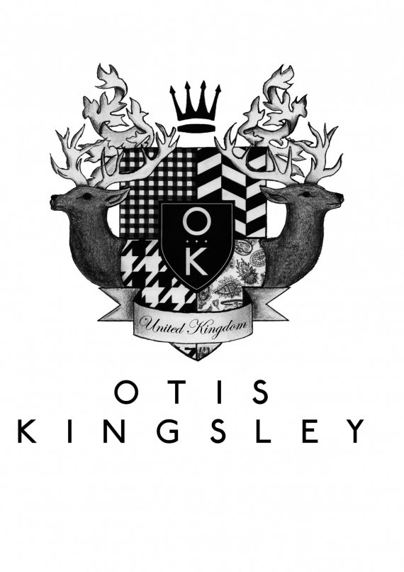
O T I S K I N G S L E Y
Charlie ParkerUK | Sun, 06/03/2012 - 12:58
Brief from client
Brand a male fashion line, that looks as though it has been around a few years. The garments are using British heritage designs on modern, wearable pieces.


16 Comments
nice..
fuzzy details in the upper part...
but overall, heritage style preserved ... well done
Nice one. Maybe you can try an "older look" for that logo, and make a better integration with the typography. Let's see...
i like that stuff, but you can work a little on gradients, they seem a little rough. overall it;s ok.
Very nice but the font of OTIS is a bit foreign to the logo i feel...Maybe the text is just too big?
Good idea, but if you change the typography more handwritting and the "O T I S K I N G S L E Y" use the same typo, and use a cepia colors
Thank you for all the feedback, I am extremely grateful. And will take all of these points into consideration.
The Oak leaves on top are a little clashing with the horns of the deere. I would take out the leaves completely and maybe enlarge the deeres' horns slightly.
Is that a bitmap? I do like, but the idea is to keep that look or do it a little better?
I love the logo but is it going to stay hand drawn or are you planning on vectoring it?
Yes it does look as though it has been around a few years.
Liked every bit of it.. just try reducing the letter spacing for OTIS KINGSLEY.. it looks to spacey...
agree ;)
great i like very much. Do u have a colored version?
Very nice..,a very good idea, I think there are still many gaps to be gaps in Trim.
absolutely love the concept. i feel the lines need to be a bit weightier and more uniform. great job.