Omicron
billyromoleroux... | Fri, 01/13/2017 - 16:12
Brief from client
Create an eco logo with the word Omicron
Thinking about the ecological and recycling activities of a service company, which focuses on encouraging its workers to apply the themes exposed throughout the year.
4 Comments
Please present your logo in English, so everybody feels included in the conversation. And you will get more comments that way.
Gracias!
Thanks for the translation.
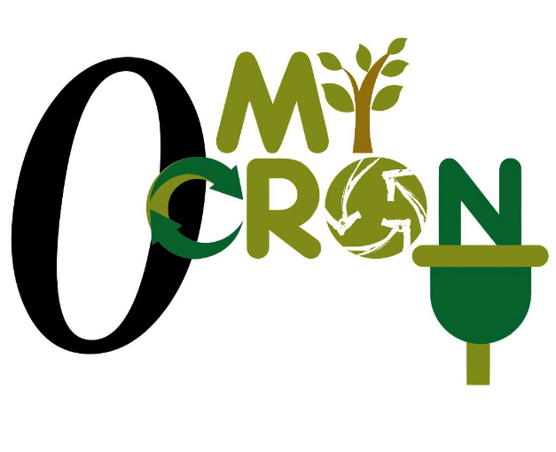
Here's my critique. This doesn't work at all, unfortunately. It's simple, without the title of your post, I have not the slightest idea of what I'm supposed to read here.
The order of the characters is all over the place, there are way too many symbols (4 when there should be only 1), that branch looks nothing like an i or any character for that matter (though to be honest, one of my colleagues thought it was a y)
Bottom line is, the logo fails to do everything what it's supposed to do: to be simple and memorable.
What you need to do is follow a proper creative process, in which using Illustrator is the very last step. Start with some research about the market your logo is supposed to represent. See what other brand have in terms of strategy and branding.
Then get some good old inspiration from like-minded logos. Sites like www.logopond.com, www.dribbble.com are good places to start. Also, getting an account on www.pinterest.com is a must.
One you got that creative juice flowing, turn off your computer, grab a pen and a piece of paper and sketch like you've never sketched before. Lay down hundreds of ideas, whatever goes through your mind. This is how ideas will almost magically pop up in your mind.
Only when you've identified a few solid ideas and refined them you can start executing them on screen. But at that point, you should already have a clear idea of where you're going.
Good luck!
Without reading the brief I had no idea what this logo was, "My Ocron"
I think there is too much going on.
Perhaps just one line, Omicron.
You could still have some sort of tree looking object as the "I", maybe one "recycling symbol" and underline with the power cord?
Add me to the camp that read this as "My Ocron." Legibility aside, there are so many symbols and elements in here that I don't have any idea what this is about, based on the logo alone. I would say it's a paper recycling company, but then the green plunger thing throws me off.
Needless to say, I echo the sentiments of the others here.