On Designer
Brief from client
Logo for designer.
Following the idea of being connected.
On knowledge, books, updates.
The designer should be on, always connected.
Logotipo pra designer.
Seguindo a ideia de ligado.
Ligado em conhecimento, livros, atualidades.
O designer deve estar ligado, sempre.

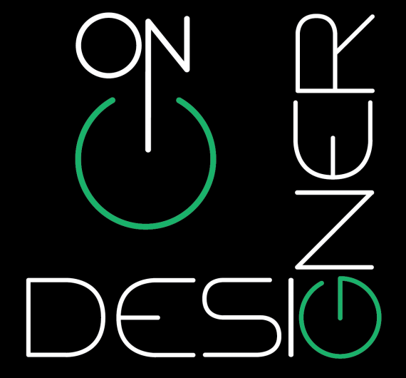
The square shape fits in various layouts.
The G character resembles the symbol turned on and off of electronic devices.
The black background indicates seriousness and green indicates connected. Open signal.
The source is a geometric linear. Geometry related to Bauhaus and design.
A forma do quadrado se encaixa em vários layouts.
O caractere G girado se assemelha ao simbolo de ligar e desligar de aparelhos eletronicos.
O fundo preto indica seriedade e o verde indica ligado. Sinal aberto.
A fonte é uma lineal geometrica. Geometria relacionada a Bauhaus e design.


2 Comments
The idea of playing with G like it's an on/off button is pretty cool. But right now, this is a mess. Basically, you have 2 logos scrammed together in a box. It's very confusing and hard to read.
Keep it simple. You don't need to put the focus on "ON". Also, vertical text is never a good idea, even though I see what you tried to do here. I'd stack up "on" and "designer", and have the G vertical, so it looks like a button.
You want to be careful with kerning, also, it's all over the place.
Good luck.
when I make changes, I should delete this file and post another? Or just post another file?