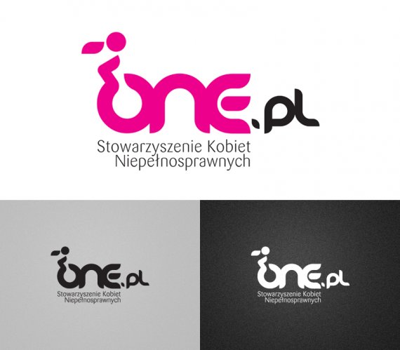
ONE PL LOGO
Brief from client
The idea of the project was to create a new logo, image of the Association of Women with Disabilities ONE.PL. One in the Polish language means: “they”, but only in the feminine gender.
The Association is made up of women on wheelchairs. Those women are dynamic, active, full of passion, energy and fully aware of their femininity.
Association was made to fight intolerance and help other women with disabilities in the opening to the world and people. His example shows that a woman in a wheelchair is a full-fledged employee, a man and above all a woman.

Basic color is 100% Magenta. This is a reference to the pink, associated with a woman, but it is not pink like Barbie or Hello Kitty. Magenta is a clear, strong color of temperament with a saturation of 100%.
Logo is illustrate the courage, confidence and achieving their dreams and goals. The dynamic forward movement shows the distance to themself and the world.


17 Comments
I like it.
I don't especially like Danube font but you made it look good as a graphic here.
My only remark would be that 'dot' between one & pl, it's just not sitting right.
Overall, this looks pleasing and memorable. Good job.
Thank u 4 comments. Splashster what do you mean: "not sitting right". Do you think it's something wrong with the space? position? or maybe shape? Please tell me more, if u can.
Position and shape of the dot.
In my opinion it would look better if it was aligned to the bottom of the complete text and shape changed to reflect lower stub of letter 'E' on the left side and straight line of letter 'p' on the other side.
Simply make it flow naturally from 'E' to 'p'.
agree with splashter...would change the dot...other than that good job.
OK, thanks a lot, but what's wrong with the dot? Position? Size? Shape? I dont see the problem.
the dot just seems to be off in my eyes thats all
Something like that? I'm nor sure, that dot should be so visible, but I really like it. I like very much connection "dot" and "p". I hope, You mean something like that.
Not exactly like this, you just made it bigger and bottom aligned, this is not it.
The left side of the dot should follow the slope (curve) of the adjacent 'E' slope.
You can keep the original size, if you make it bigger it doesn't look good.
Sorry, but I'd like to understand you. I think, you mean something like no. 3 or 4...
yeah i think he means something like 4
It's great. I would have the DOT and PL on the same line as ONE. Not sure why that wasn't brought up. I could be wrong.
ANYONE ELSE - THOUGHTS???
I would change the dot to a circular dot. And put ".pl" aligned to the bottom of "ONE".
I think that the tagline should be centered with "ONE" since ".pl" might not be part of the original logo. You know, you add the TLD at marketing time.
EDIT. Also, I'm not sure if the illustration of the lady on the wheelchair is necessary. I would remove it and leave the "O" alone.
Personally i feel that the lady within the "O" works quite feel with what the designer is trying to portray. Its simple, clean and not too crazy to comprehend. Without that abstract mark it is just the danube typeface in magenta.
OK, OK... Thank you, thank you very much 4 all comments. Ones again I see that details makes a successful logo. I think whole disquisition is about the dot. I'm not going to change "the lady", as natman462 said: without the lady it's just the danube typeface in magenta. She makes the logo unique.
So, ones again please all of you for help. Everyone said, that dot must be on the bottom. I'm surrounded by professionals and I'm open minded, so... yes, ok. Now I see 3 ways: original danube typeface dot, "new" dot with E shape on left site and a circular dot.
pl can be a little bit higher (as something extra) or o the same line as ONE.
Any suggestions, ideas?
#5
(middle of bottom row)
In my extremely humble opinion.
Agree with G13, it seems to visually work better than the others.